Documentation
InnovaStudio
ContentBuilder.js is a drag & drop HTML editor javascript library. It is the first editor that allows you to build content layout in almost any css grid framework such as Bootstrap, Tailwind, Foundation and more.
2
………………………………………………………………………………………. 5
…………………………………………………………………………………………………………….. 7
…………………………………………… 8
……………………………………………………………………………………… 9
…………………………………………………………………………………………………….. 10
………………………………………………………..……………………. 12
…………………………………………………………………………… 13
………………………………………………………………… 13
………………………………………… 15
……………………………………………………….….. 15
……………………………………..………. 16
……………………………………………………………………………………….. 17
……….….. 18
………………………………………….…………………….…………………………………………………………………. 19
…………………………………………………………………………………………..……………………………………….. 20
………………………………. 21
………………………………………………………………………………………….. 25
…………………………………………………………………..……………………..……………… 26
……………………………………………………………………….…………..……………. 27
……………………………………………………………………..……………. 28
……………………………………………………….…………………………………………..……………. 30
…………………………………………………………………………………..……………… 30
……………………………………………………………………………..…………….. 30
…………..…………..……………… 31
……………….. 32
…….. 32
3
……………… 33
…………………………………………… 34
……………………………….. 35
……………… 37
…………………………………………… 38
……………………………….. 39
……………………………………………………………………………………. 40
…………………………………………………………………………………… 47
……………………………………………………………. 48
…………………………………………….. 55
…………………………….. 59
……………… 60
……………………………………………………………….. 60
…………………………………………………………………………….. 64
…………………………………………………………………………. 65
……..…………………………………………………………. 66
……………………………………………………………………….. 66
……………………………………………………………………………..…………………….. 67
…………………………………………………………………………………… 68
………………………………………………………………………………… 71
…………………………………………………………………………………… 73
……………………………………………………………………………………… 74
………………………….……………………………………………. 75
…………………………..…………………………………………….. 76
………………………………………………………………………………………….. 77
……………………………………….………………………. 78
………………………………………..…………………………….. 79
………………………………….……………………….. 80
……………………………………………………… 81
………………………………………………….………………………………… 82
………………………………………………………………..………… 83
……………. 84
……………………………………………. 84
………. 85
4
…………………………………………………………………………………………………….. 86
…………….………………………………………… 91
…… 92
…………….………. 92
………………………………. 92
…………………. 93
…………….…………. 93
…….… 94
………………………………………………………………..…………… 94
………………………………………………………………………..……………………. 95
………………………………………………………………..………………….. 96
………………………………………………………………………………..…………………… 97
….…………………………………………………………………..…………………. 104
……………………………………………………………………..………………… 105
……………………………………………………………………………………..……………….. 105
…………………………………………………………………………………..………………… 106
…………………………………………………………………………..…………….. 107
Include the main css file:
<link rel="stylesheet" href="contentbuilder/contentbuilder.css" />
and the css file for snippets:
<link rel="stylesheet" href="assets/minimalist-blocks/content.css" />
Step 1
CSS
5
Step 2
<script src="contentbuilder/contentbuilder.min.js" type="text/javascript">
Install as Web Library
Or Install with NPM
npm install @innovastudio/contentbuilder
import ContentBuilder from '@innovastudio/contentbuilder';
Then import into your project:
JS
6
<div class="container">
</div>
const builder = new ContentBuilder({
    container: '.container'
});
To get the HTML:
let html = builder.html();
Then you can do anything with the html, for example, posting it to the server for saving, etc.
7
Canvas mode is a new option that allows you to freely position blocks. To enable canvas mode, please specify the canvas and previewURL parameters as follows:
const builder = new ContentBuilder({
    container: '.container',
    canvas: true,
    previewURL:'preview-canvas.html'
});
Then include the following css and js on the page:
<link rel="stylesheet" href="block/block.css" />
<script src="block/block.js" type="text/javascript"></script>
An example of canvas mode is provided in the package. Please try: example-canvas.html.
8
ContentBuilder.js is written in pure Javascript (ES6) so you can use it in most situations. Sample use in simple HTML, PHP, React and Vue projects are included.
React and Vue project examples are provided in separate downloads in the user area.
9
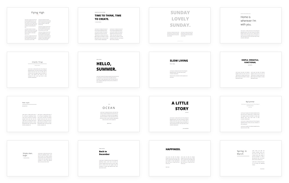
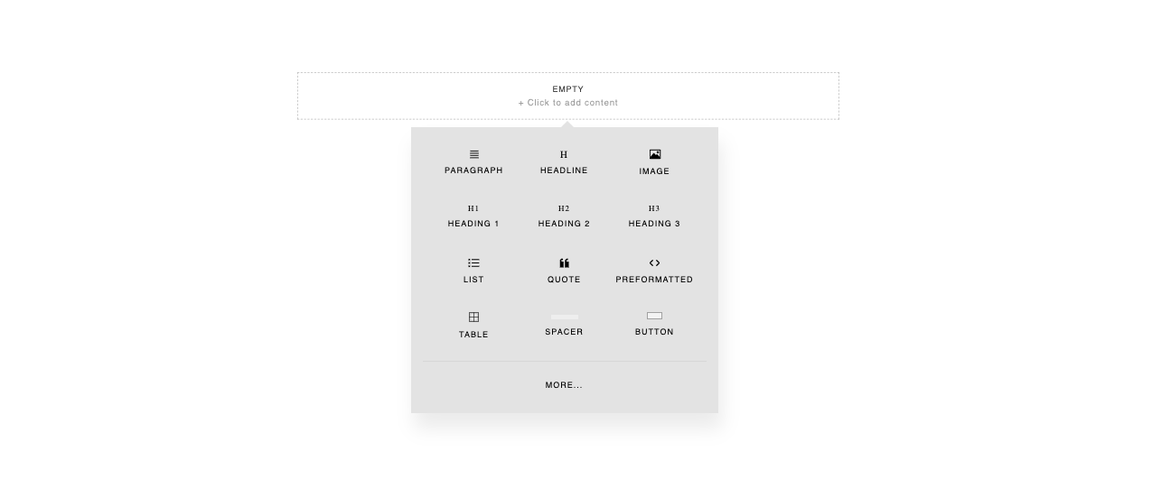
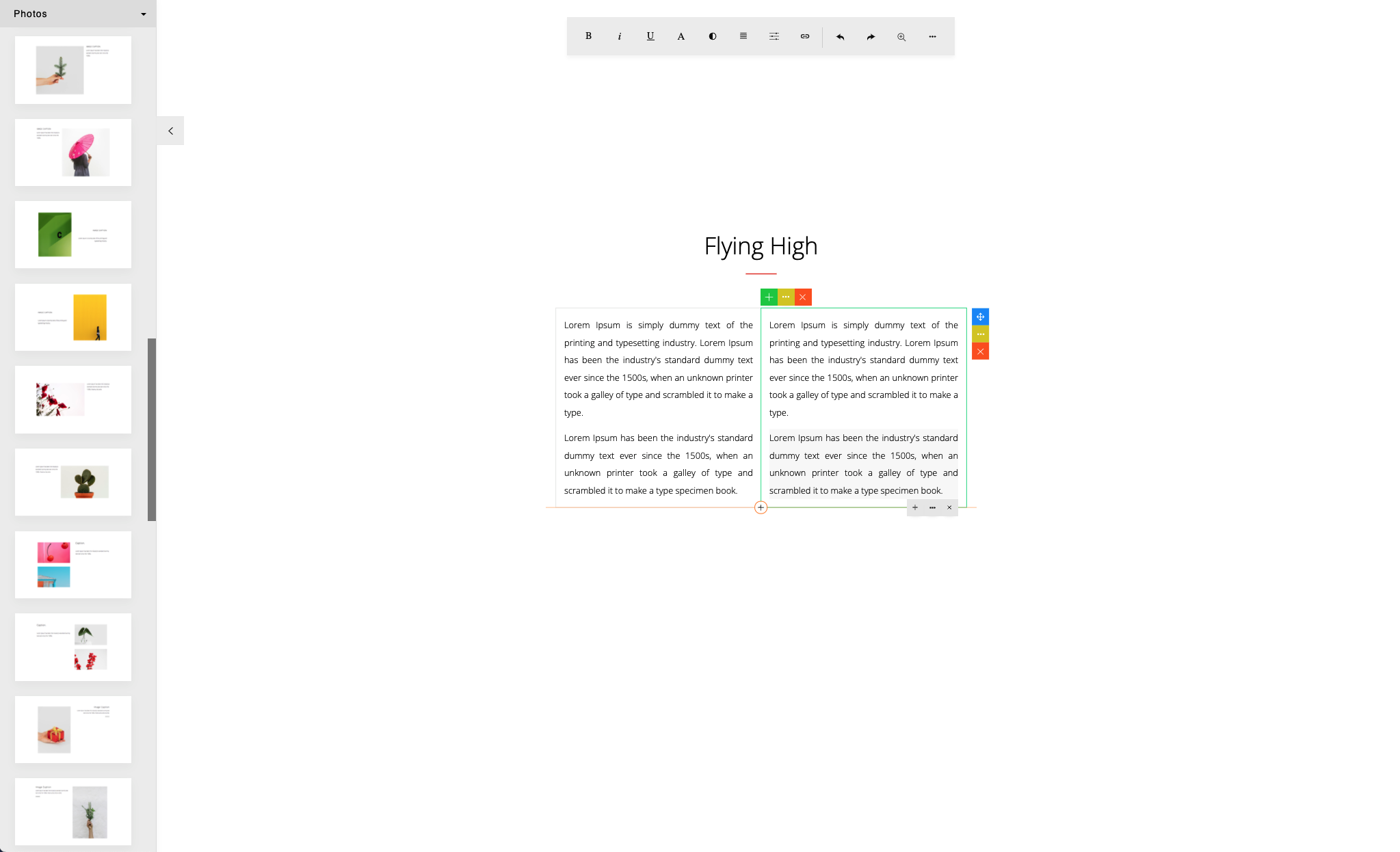
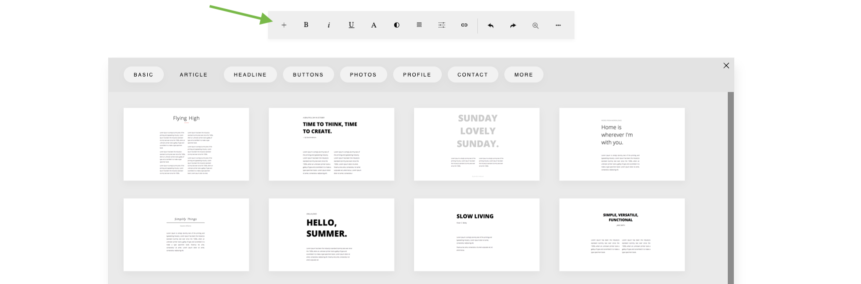
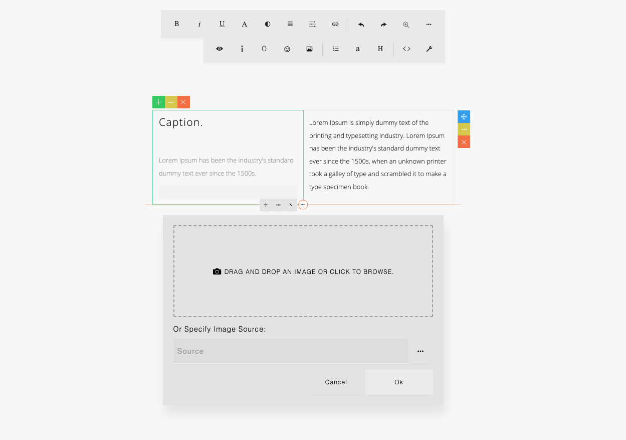
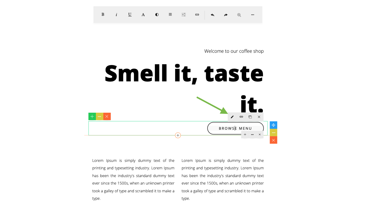
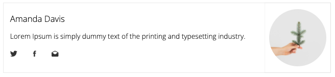
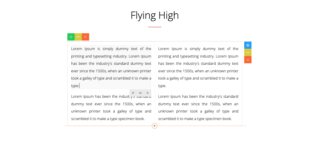
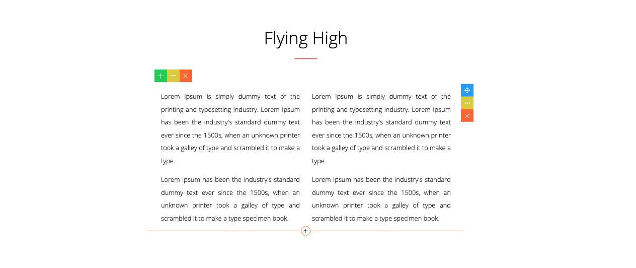
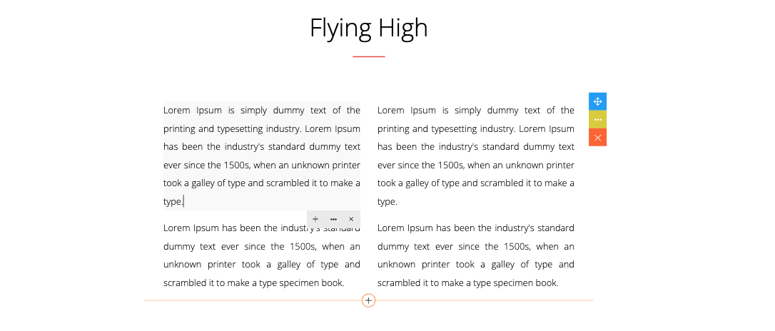
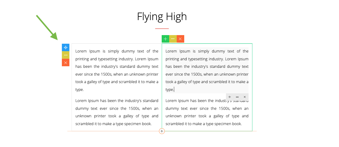
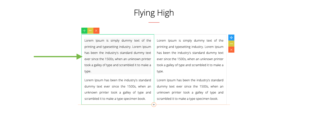
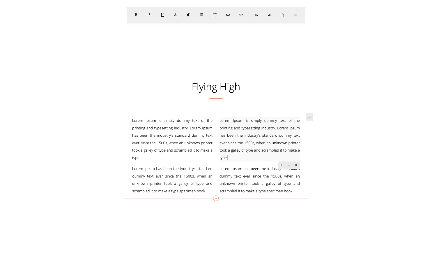
Snippets are predesigned blocks that you can add or drag & drop into your content.
By default, snippets are enabled. When you add a content, please click the MORE button to open the snippets dialog.
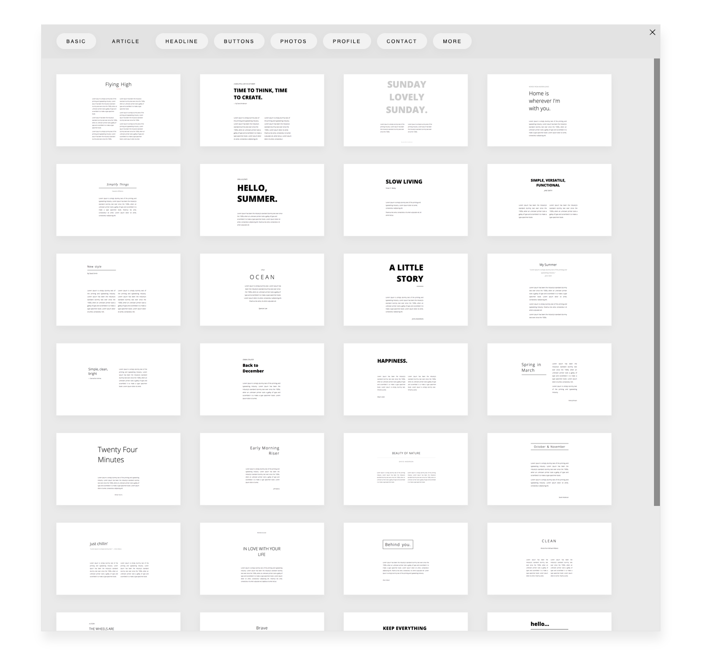
Snippet dialog opened.
10
Snippet files are located in the folder:
assets/minimalist-blocks/
It contains:
You can configure the snippets location by setting the snippetUrl and snippetPath parameters:
const builder = new ContentBuilder({
    container: '.container',
    snippetUrl: 'assets/minimalist-blocks/content.js', // Snippet file
    snippetPath: 'assets/minimalist-blocks/',  // Location of snippets' assets
});
In case of a different location, path adjustment may be needed. Here you can use the snippetPathReplace parameter.
In this example, the default location is changed to mycustomfolder/assets/minimalist-blocks/
const builder = new ContentBuilder({
    ...
    snippetPathReplace: ['assets/minimalist-blocks/', 'mycustomfolder/assets/minimalist-blocks/'],
    ...
});
11
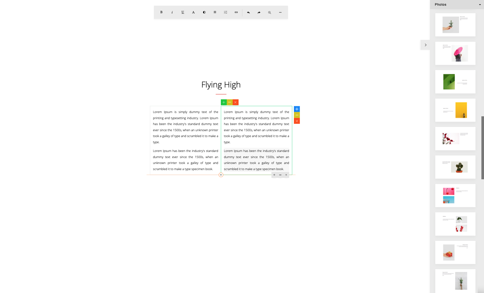
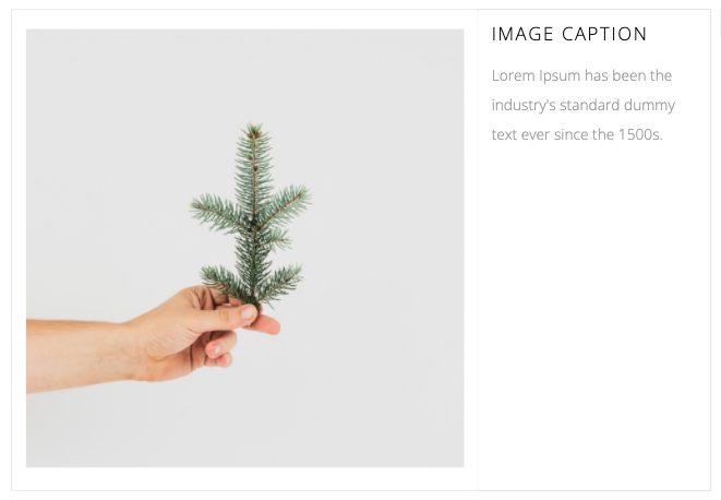
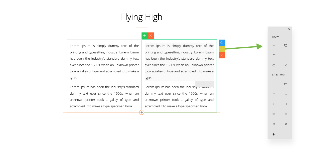
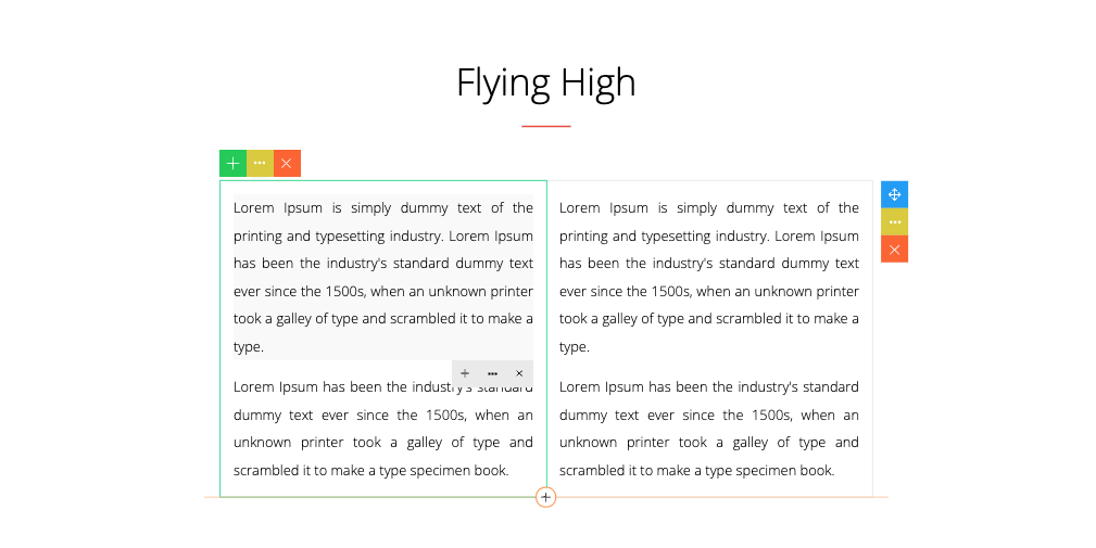
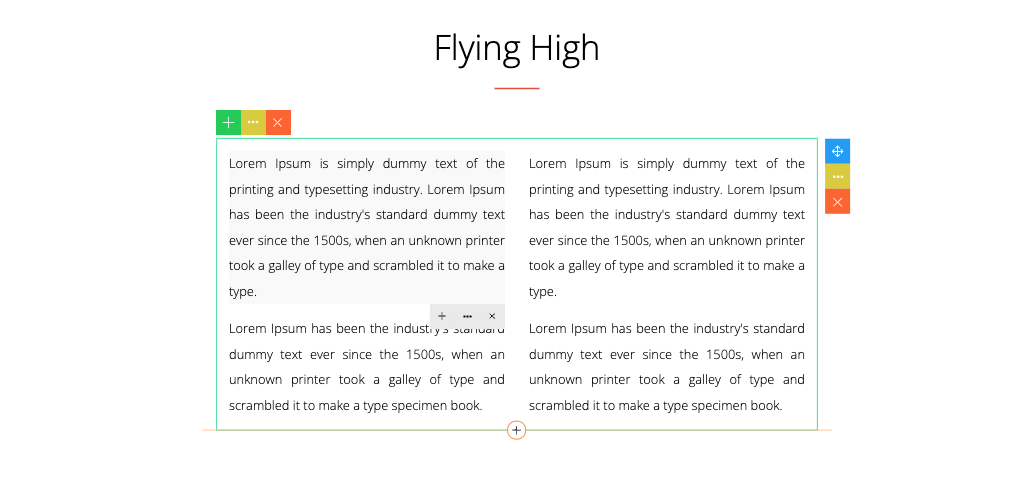
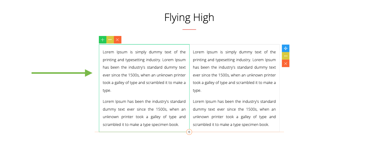
Snippets can be displayed on a side panel. This allows you to drag & drop snippets into your content.
12
By default, this feature is not enabled.
To enable this feature, include the snippet file on the page:
<script src="assets/minimalist-blocks/content.js" type="text/javascript"></script>
Or load it programmatically:
builder.loadSnippets('assets/minimalist-blocks/content.js');
Here are some options to configure the snippet side panel:
Placement
const builder = new ContentBuilder({
    container: '.container',
    sidePanel: 'left'
});
13
The default placement is ‘right’. If set to ‘left’, the placement will be on the left as seen below.
14
Open on the first load
By default, the snippet side panel is closed. To open it on the first load:
const builder = new ContentBuilder({
    container: '.container',
    snippetOpen: true
});
Display mode
If the snippet side panel is not used (during editing), it will be automatically closed. To make it always visible:
const builder = new ContentBuilder({
    container: '.container',
    snippetDisplay: 'visible' // default: auto
});
15
Snippet Categories
Snippets have multiple categories for different purposes. The built-in categories are defined in the snippetCategories parameter:
The defaultSnippetCategory specifies the category to open on the first load.
const builder = new ContentBuilder({
    container: '.container',
    snippetCategories: [
        [120,'Basic'],
        [118,'Article'],
        [101,'Headline'],
        [119,'Buttons'],
        [102,'Photos'],
        [103,'Profile'],
        [116,'Contact'],
        [104,'Products'],
        [105,'Features'],
        [106,'Process'],
        [107,'Pricing'],
        [108,'Skills'],
        [109,'Achievements'],
        [110,'Quotes'],
        [111,'Partners'],
        [112,'As Featured On'],
        [113,'Page Not Found'],
        [114,'Coming Soon'],
        [115,'Help, FAQ']
    ],
    defaultSnippetCategory: 120, // the default category is 'Basic'
});
16
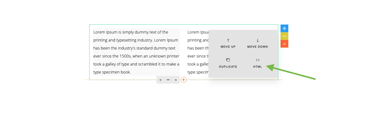
You can enable the Snippet button on the toolbar for quick access to the snippets.
Here you can open the Snippet dialog from the toolbar by clicking the (+) button.
To enable the button:
const builder = new ContentBuilder({
    container: '.container',
    toolbarAddSnippetButton: true
});
Please see the Toolbar section for more customization on the toolbar.
17
Programmatically Open Snippet Dialog
If needed, you can open the Snippet dialog programmatically by calling the viewSnippets() method:
builder.viewSnippets();
18
With the Language file, you can translate the ContentBuilder.js interface into another language.
The provided language files:
<script src="contentbuilder/lang/en.js" type="text/javascript"></script>
To enable the language file, you need to add the file before including ContentBuilder.js:
or
<script src="contentbuilder/lang/fr.js" type="text/javascript"></script>
Here is the language file content as seen on en.js:
var _txt = new Array();
_txt['Bold'] = 'Bold';
_txt['Italic'] = 'Italic';
You can create your own language file by copying/modifying this file.
19
ContentBuilder.js allows you to insert icons. Some snippets are designed using icons as well. Icons are located in the assets folder:
assets/ionicons/
You can see the icons that are imported in the snippet css file (assets/minimalist-blocks/content.css):
@import url("../ionicons/css/ionicons.min.css");
You can modify this if you want to change the location of the icons.
Note that icons need to be located inside the assets folder. You can change the assets folder location by setting:
const builder = new ContentBuilder({
    container: '.container',
    assetPath: 'assets/',
});
20
You can specify your own custom file/media browser (or Asset Manager) to work with ContentBuilder.js.
As an example, a simple file/media browser (assets.html) is provided with some sample images or videos that you can select and insert into your content.
To configure:
const builder = new ContentBuilder({
    container: '.container',
    imageSelect: 'assets.html',
    fileSelect: 'assets.html',
    videoSelect: 'assets.html'
});
21
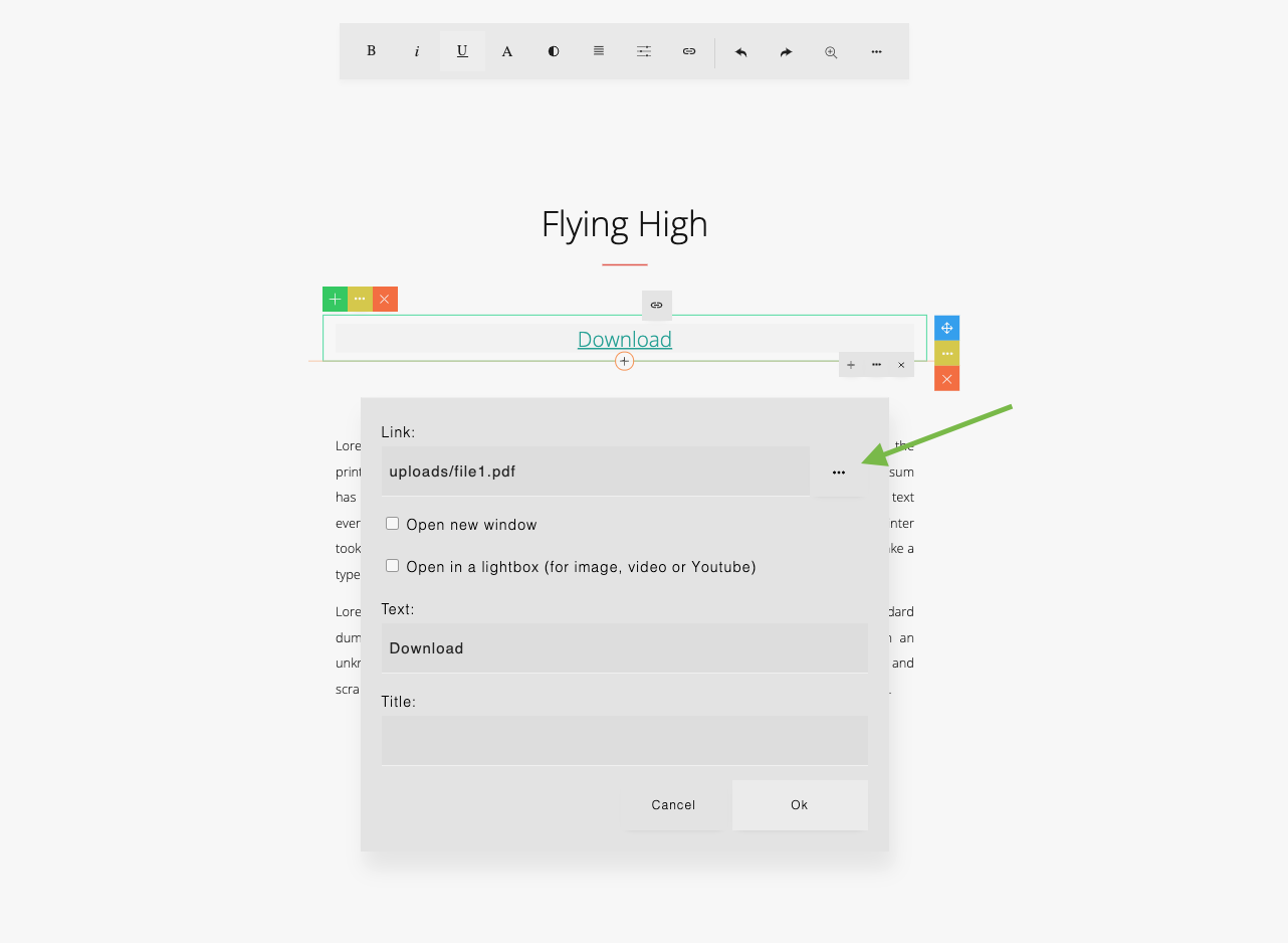
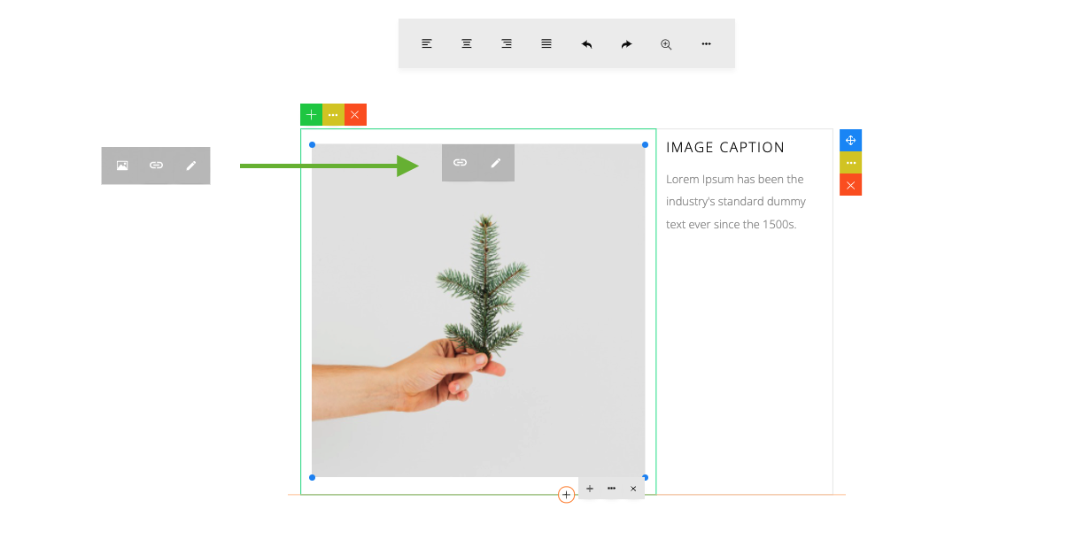
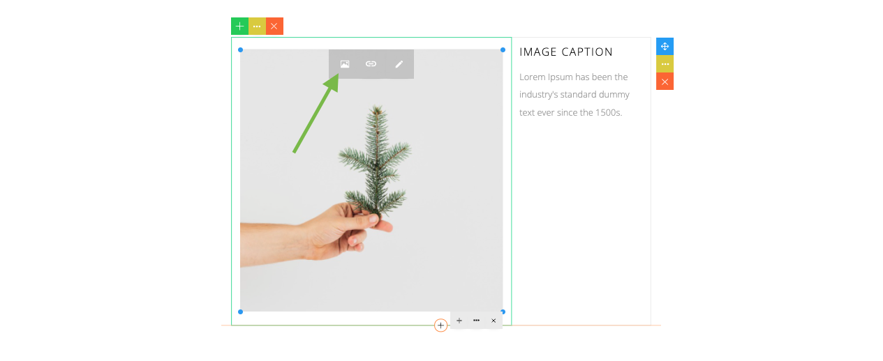
To try, click the link icon (1) on a selected image to open the image dialog. On the image dialog, you see a browse button displayed (2).
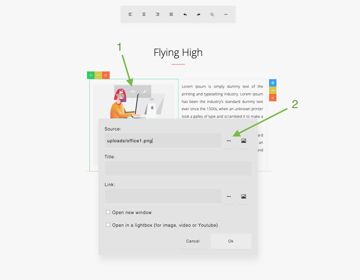
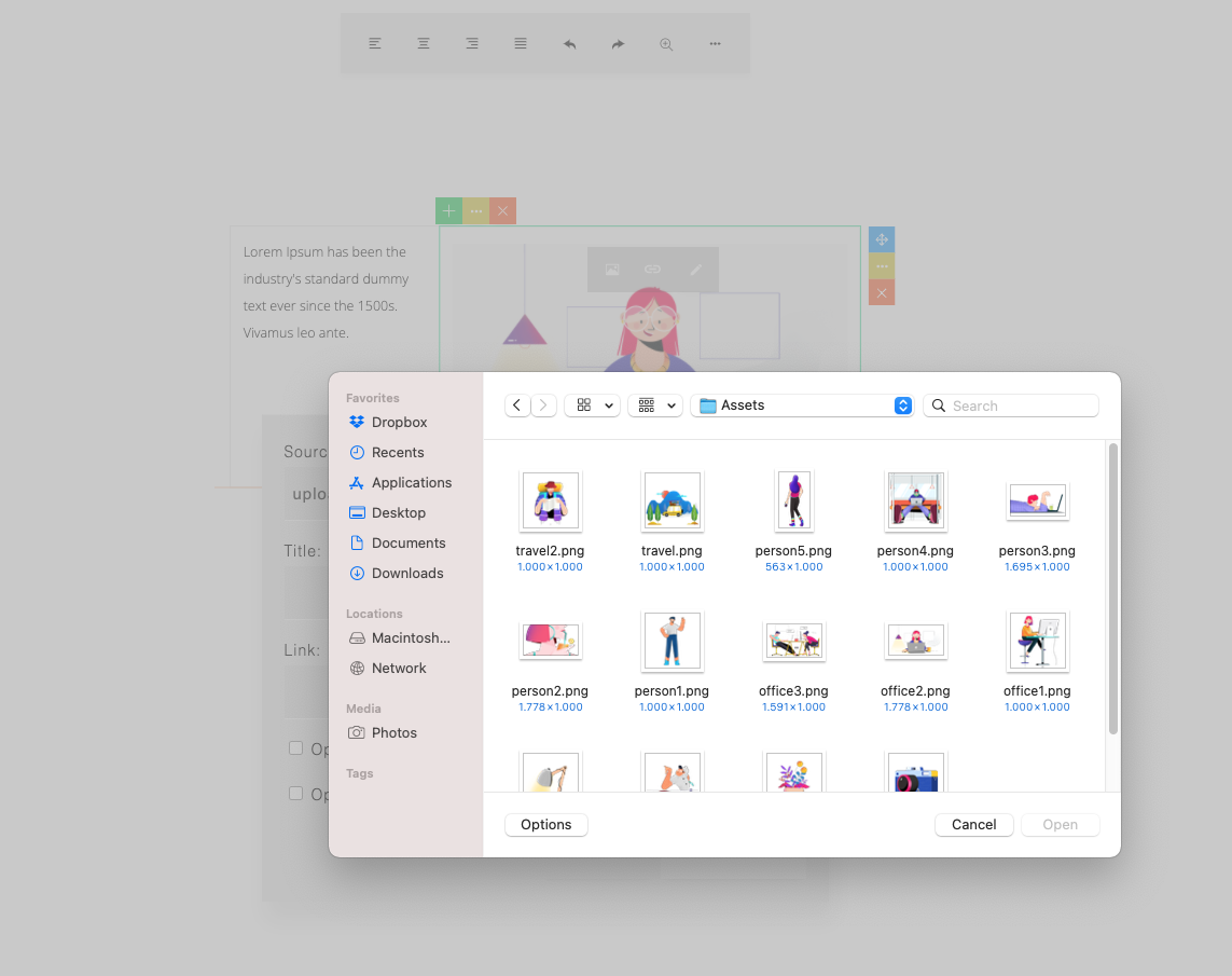
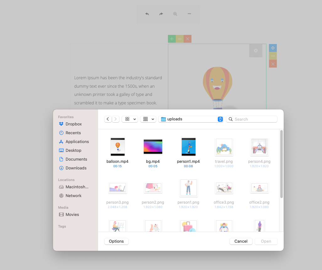
Click the browse button to open the file/media browser as specified (the assets.html).
22
File/media browser opened:
Then you can select an image.
23
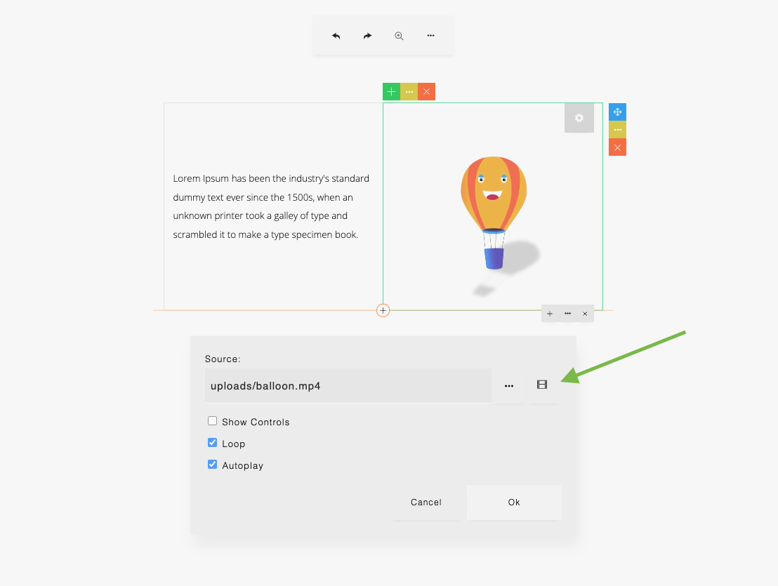
The file/media browser can also be opened from the link dialog and video settings dialog.
Click the browse button to open the file/media browser as specified (the assets.html).
24
Please see assets.html if you want to create your own file/image browser. Use the selectAsset() function as shown in assets.html to work with ContentBuilder.js. So when you select a file or image, the url will be returned to ContentBuilder.js.
Using Custom Function
You can replace the imageSelect, fileSelect and videoSelect parameters with the onImageSelectClick, onFileSelectClick and onVideoSelectClick parameters that will run your own custom function.
const builder = new ContentBuilder({
    container: '.container',
    onImageSelectClick: function () { ... },
    onFileSelectClick: function () { ... },
    onVideoSelectClick: function () { ... },
});
25
When you insert an image or change an embedded image, you will be able to browse the local image file. The selected image will be embedded as a base64 format in your content, so you will see the result immediately without having to wait for the image upload process.
26
The embedded image will be:
<img src="data:image/jpeg;base64,/9j/4AAQSkZJRgABAQAA....">
You can save all embedded base64 images to the server by calling the saveImages() method. Normally, you’d call the saveImages() method on your saving implementation. So before saving the HTML content, all embedded images will be saved first on the server (ex. as jpg, png) and all base64 image sources will be replaced (automatically) with the physical image url. Then the HTML content can be saved. This process is made simple by using the saveImages() method.
There are 2 ways to use the saveImages() method:
1. Using Form Method
Example (if you’re using PHP):
builder.saveImages('saveimage.php', function(){

    // Image saving done. Then you can save the content
    let html = builder.html();

    // ...

});
Here you specify a server side handler (saveimage.php) that performs the file saving on the server. File saving on the server is not part of ContentBuilder.js and depends on your server environment. As examples, you can use the provided handler:
Please add your own security handling on these files.
To try a working example, please open example2.php.
27
builder.saveImages('', ()=>{

    // Image saving done. Then you can save the content
    let html = builder.html();

    // ...

}, (img, base64, filename)=>{

    // Upload base64 images
    const reqBody = { image: base64, filename: filename };
    fetch('/uploadbase64', {
        method:'POST',
        body: JSON.stringify(reqBody),
        headers: {
            'Content-Type': 'application/json',
        }
    })
    .then(response=>response.json())
    .then(response=>{
        if(!response.error) {
            const uploadedImageUrl = response.url;
            img.setAttribute('src', uploadedImageUrl); // Update image src
        }
    });

});
2. Using AJAX Post Method
In this example, each image will be sent to an endpoint: /uploadbase64
28
Example use of the AJAX post method can be seen on:
const express = require('express');
const fs = require('fs');
const app = express();
const path = require('path');
const cors = require('cors');
const serveStatic = require('serve-static');
const formidable = require('formidable-serverless');
const sharp = require('sharp');

var $path =  __dirname + '/public/uploads/'; // Physical path
var $urlpath = 'uploads/'; // URL path

app.use(cors());
app.use(express.urlencoded({
    extended: true
}));
app.use(express.json({ limit: '50mb' }));
app.use(serveStatic(path.join(__dirname, '/public')));

app.post('/uploadbase64', async (req, res) => {
    const base64Data = req.body.image;
    const filename = req.body.filename;

    let extension = path.extname(filename).toLowerCase();

    let imageFile=base64Data;
    if(extension  === '.jpeg' || extension === '.jpg') {
        let img = new Buffer.from(base64Data, 'base64');
        imageFile = await sharp(img).resize(1600, 1600, {
            fit: sharp.fit.inside,
            withoutEnlargement: true,
        })
        .jpeg({ quality: 70, progressive: true, force: false })
        .toBuffer();
    }
If you’re using Node.js, you can implement the endpoint to save the images using:
29
    fs.writeFile($path + filename, imageFile, 'base64', async (err)=>{
        if (err) {
            res.status(500).json({
                ok:true, status: 500,
                error: 'Something went wrong.'
            });
            return
        }
        res.status(200).json({
            ok:true, status: 200,
            url:  $urlpath + filename
        });
    });
});

app.listen(8081, function() {
    console.log('App running on port 8081');
});
Here are some options you can set to configure the image embed functionality:
Image Quality
const builder = new ContentBuilder({
    container: '.container',
    imageQuality: 0.92,
});
Maximum Width
const builder = new ContentBuilder({
    container: '.container',
    maxEmbedImageWidth: 1600,
});
If maxEmbedImageWidth is set to -1, then no maximum width will be applied (will use original image width).
30
Enable/Disable Embed Image Feature.
const builder = new ContentBuilder({
    container: '.container',
    imageEmbed: false,
});
If imageEmbed is set to false, the browse image button will not be displayed as seen below.
31
Using Custom Function on Browse Image Click
const builder = new ContentBuilder({
    container: '.container',
    onImageSettingClick: function() { ... },
});
The function will be called when the image settings button is clicked.
32
Using Custom Function on Image Link/Settings Click
const builder = new ContentBuilder({
    container: '.container',
    onImageBrowseClick: function() { ... },
});
The function will be called when the browse image button is clicked.
A browse local image button can be enabled on the Image dialog. This can be used to select and upload image to the server.

33
There are 2 ways to enable the button:
1. Using Form Method
Use the mediaHandler parameter. You can also use the largerImageHandler parameter (previous version) which is the same and still works.
const builder = new ContentBuilder({
    container: '.container',
    mediaHandler: 'savemedia.php' // or savemedia.ashx if you're using ASP.NET
});
Here you specify a server side handler for uploading files.
As examples, you can use the provided handler:
By default, images are saved in the upload/ folder. You can change the upload folder by editing savemedia.php or savemedia.aspx.
34
2. Using AJAX Post Method
Use the onMediaUpload parameter. You can also use the onLargerImageUpload parameter (previous version) which is the same and still works.
const builder = new ContentBuilder({
	container: '.container',
	onMediaUpload: (e)=>{
	    uploadFile(e, (response)=>{
		if(!response.error) {
		    const uploadedImageUrl = response.url;
		    if(uploadedImageUrl) obj.returnUrl(uploadedImageUrl);
		}
	    });
	},
});

function uploadFile(e, callback) {

	const selectedFile = e.target.files[0];

	const formData = new FormData();
	formData.append('file', selectedFile);
	fetch('/upload', {
	    method: 'POST',
	    body: formData,
	})
	.then(response=>response.json())
	.then(response=>{
	    console.log(response)
	    if(callback) callback(response);
	});
}
35
The example above uses the returnUrl(url) method to apply the uploaded image url back to the image dialog. You can also use the applyLargerImage parameter (previous version) which is the same and still works.
In the example, file will be sent to an endpoint: /upload
Working examples can be seen on the React & Vue examples:
36
A browse local video button can be enabled on the video dialog. This can be used to select and upload video (mp4 file) to the server.
37
There are 2 ways to enable the button:
1. Using Form Method
Use the videoHandler parameter.
const builder = new ContentBuilder({
    container: '.container',
    videoHandler: 'savemedia.php' // or savemedia.ashx if you're using ASP.NET
});
Here you specify a server side handler for uploading files.
As examples, you can use the provided handler:
By default, videos are saved in the upload/ folder. You can change the upload folder by editing savemedia.php or savemedia.aspx.
38
2. Using AJAX Post Method
Use the onVideoUpload parameter.
const builder = new ContentBuilder({
	container: '.container',
	...
	onVideoUpload: (e)=>{
	    uploadFile(e, (response)=>{
		if(!response.error) {
		    const uploadedFileUrl = response.url;
		    if(uploadedFileUrl) obj.returnUrl(uploadedFileUrl);
		}
	    });
	},
});

function uploadFile(e, callback) {

	const selectedFile = e.target.files[0];

	const formData = new FormData();
	formData.append('file', selectedFile);
	fetch('/upload', {
	    method: 'POST',
	    body: formData,
	})
	.then(response=>response.json())
	.then(response=>{
	    console.log(response)
	    if(callback) callback(response);
	});
}
39
With plugins, you can extend the ContentBuilder.js features. A plugin can add an additional button into the ContentBuilder.js toolbar. For example, a ‘wordcount’ plugin adds a button in the toolbar and when clicked, a dialog showing the word count info will be diplayed.

40
Plugin scripts are located in the plugins/ folder inside contentbuilder/.
You will see the folder containing some prebuilt plugins:
To load the plugins, you can configure:
const builder = new ContentBuilder({
    container: '.is-container',
    plugins: [
        { name: 'preview', showInMainToolbar: true, showInElementToolbar: true },
        { name: 'wordcount', showInMainToolbar: true, showInElementToolbar: true },
        { name: 'symbols', showInMainToolbar: true, showInElementToolbar: false },
    ],
    pluginPath: 'contentbuilder/',
});
Here we specify the plugins and pluginPath parameters.
41
The plugins parameter accepts list of plugins with configurations:
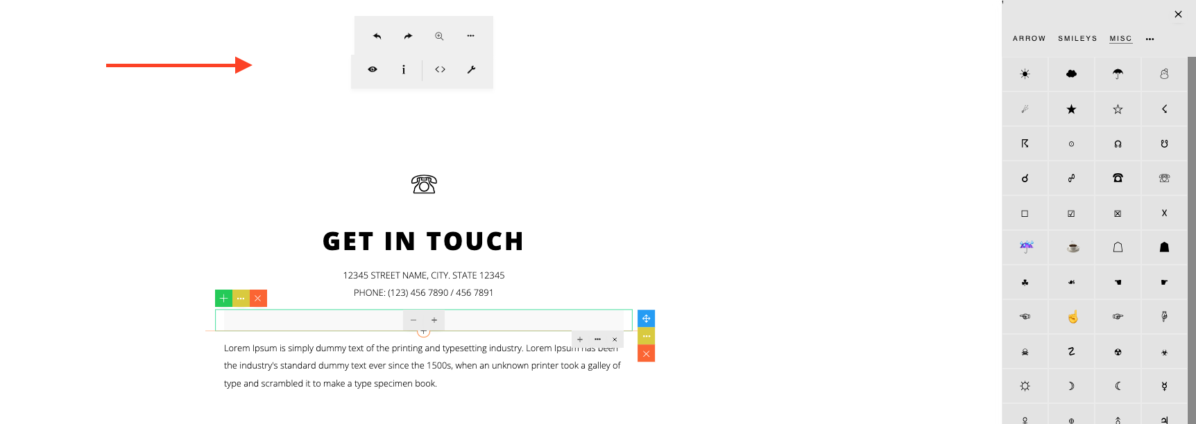
The difference between the main editing toolbar and the element editing toolbar is that the main editing toolbar shows when a text element is selected (cursor is placed on text), whereas the element editing toolbar shows when a non-text element is clicked/selected (such as when selecting an image, spacer, etc).
Main editing toolbar (text-based):
Element editing toolbar (non text):
42
As seen in the example configuration above:
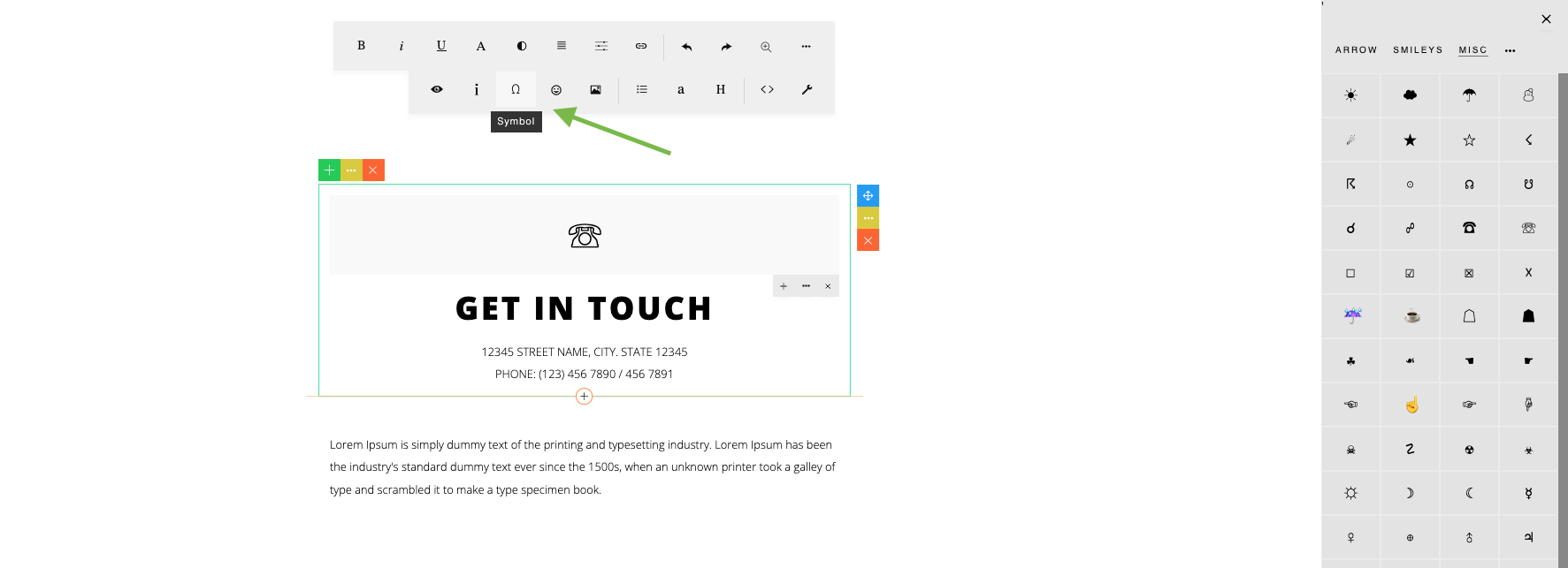
The ‘symbols’ plugin should display its button only if a text element is selected/clicked. So the showInMainToolbar (main editing toolbar) is set to true and showInElementToolbar (element editing toolbar) is set to false. Here the Symbol button is displayed on the main editing toolbar:
Here the Symbol button is not displayed on the element editing toolbar:
43
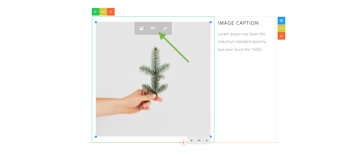
In the previous version, there is a ‘buttoneditor’ plugin which shows an edit (pencil) icon when a link button is clicked. This plugin is now integrated with the builder, so no configuration is needed.
44
An alternative way to load the plugins is by using a configuration file:
contentbuilder/config.js
If the plugins parameter is not set during initialization (as in the above example), ContentBuilder.js will automatically load this configuration file. Sample configuration in config.js:
_cb.settings.plugins = [
	{ name: 'preview', showInMainToolbar: true, showInElementToolbar: true },
	{ name: 'wordcount', showInMainToolbar: true, showInElementToolbar: true },
	{ name: 'symbols', showInMainToolbar: true, showInElementToolbar: false },
];
To disable loading this file, you can set disableConfig to false:
const builder = new ContentBuilder({
    container: '.is-container',
    disableConfig: false
});
45
['preview','wordcount']
Note that using an external configuration file is an approach that comes from the previous version of ContentBuilder.js. In the previous version, the plugins parameter is configured like this:
This still works, however we recommend using the new approach (explained above) for future flexibility.
If you want to create your own plugin, please see this guide:
https://innovastudio.com/contentbuilder-plugins
46
With modules, you can extend snippets.
Normally, snippets are defined as static HTML. With a module snippet (snippet as a module), you can a create dynamic (non-static) snippets for ContentBuilder.js. You can add custom scripts to control the snippet content, create interactive elements and make it configurable via a custom dialog.
To create your own module, please see this guide:
https://innovastudio.com/contentbuilder-blocks
Note that module files are located in:
assets/modules/
You will see there are some prebuilt modules in the folder (please see the above guide for details).
47
You can create or add your own snippets by customizing the snippet file:
assets/minimalist-blocks/content.js
The snippet file is JSON formatted.
Here is an example of a snippet definition in the snippet file:
{
    'thumbnail': 'preview/basic-01.png',
    'category': '120',
    'html':
        '<div class="row">' +
            '<div class="column full">' +
                '<h1>My Heading Text</h1>' +
            '</div>' +
        '</div>'
}
A snippet needs to have a thumbnail, category number and HTML content.
Thumbnails are created & stored in the preview/ folder:
assets/minimalist-blocks/preview/
48
Snippet categories you can use:
The HTML content for the snippets needs to be formatted in a simple grid. Here are some examples:
<div class="row">
    <div class="column full">
	...
    </div>
</div>
Single Column:
Two Columns:
<div class="row">
    <div class="column half">
        ...
    </div>
    <div class="column half">
        ...
    </div>
</div>
49
Three Columns:
<div class="row">
    <div class="column third">
        ...
    </div>
    <div class="column third">
        ...
    </div>
    <div class="column third">
        ...
    </div>
</div>
Four Columns:
<div class="row">
    <div class="fourth third">
        ...
    </div>
    <div class="fourth third">
        ...
    </div>
    <div class="fourth third">
        ...
    </div>
    <div class="fourth third">
        ...
    </div>
</div>
If you are using a css framework, such as Bootstrap or Foundation, this simple grid will be automatically converted to the framework grid you’re using.
50
Five Columns:
<div class="row">
    <div class="column fifth">
        ...
    </div>
    <div class="column fifth">
        ...
    </div>
    <div class="column fifth">
        ...
    </div>
    <div class="column fifth">
        ...
    </div>
    <div class="column fifth">
        ...
    </div>
</div>
51
<div class="row">
    <div class="column sixth">
        ...
    </div>
    <div class="column sixth">
        ...
    </div>
    <div class="column sixth">
        ...
    </div>
    <div class="column sixth">
        ...
    </div>
    <div class="column sixth">
        ...
    </div>
    <div class="column sixth">
        ...
    </div>
</div>
ContentBuilder.js has default maximum number of columns is set to 4. You can increase this limit by setting:
const builder = new ContentBuilder({
    container: '.container',
    maxColumns: 5
});
Six Columns:
Other layouts you can use to create your own your snippets:
<div class="row">
    <div class="column two-third">
        ...
    </div>
    <div class="column third">
        ...
    </div>
</div>
52
<div class="row">
    <div class="column two-fourth">
        ...
    </div>
    <div class="column fourth">
        ...
    </div>
</div>
53
<div class="row">
    <div class="column two-sixth">
        ...
    </div>
    <div class="column sixth">
        ...
    </div>
</div>
<div class="row">
    <div class="column two-fifth">
        ...
    </div>
    <div class="column fifth">
        ...
    </div>
</div>
You can also add some behavior in your HTML snippets:
To make an image not replaceable, add the data-fixed attribute to the element, for example:
To make a column not editable, add the data-noedit attribute to the column, for example:
To make a column not editable and cannot be deleted, moved or duplicated, add the data-protected attribute to the column, for example:
<img src=".." data-fixed />
<div class="row">
    <div class="column full" data-noedit>
        ...
    </div>
</div>
<div class="row">
    <div class="column full" data-protected>
        ...
    </div>
</div>
54
ContentBuilder.js can be used with popular css frameworks, such as Bootstrap, Foundation and more. There are 2 types of configuration:
1. If the framework has 12 columns grid system
Specify the framework classes using the row & cols parameters.
Example:
Bootstrap:
const builder = new ContentBuilder({
    container: '.container',
    row: 'row',
    cols: ['col-md-1', 'col-md-2', 'col-md-3', 'col-md-4', 'col-md-5', 'col-md-6',
        'col-md-7', 'col-md-8', 'col-md-9', 'col-md-10', 'col-md-11', 'col-md-12']
});
55
Foundation:
const builder = new ContentBuilder({
    container: '.container',
    row: 'row',
    cols: ['large-1 columns', 'large-2 columns', 'large-3 columns', 'large-4 columns',
        'large-5 columns', 'large-6 columns', 'large-7 columns', 'large-8 columns',
        'large-9 columns', 'large-10 columns', 'large-11 columns', 'large-12 columns']
});
2. If the framework has grid system in which the column size increment is not constant
Specify two additional parameters: colequal & colsizes
Example:
56
Tailwind:
const builder = new ContentBuilder({
    container: '.container',
    row: 'flex flex-col md:flex-row',
    cols: [
        'w-full md:w-1/12 px-4',
        'w-full md:w-2/12 px-4',
        'w-full md:w-3/12 px-4',
        'w-full md:w-4/12 px-4',
        'w-full md:w-5/12 px-4',
        'w-full md:w-6/12 px-4',
        'w-full md:w-7/12 px-4',
        'w-full md:w-8/12 px-4',
        'w-full md:w-9/12 px-4',
        'w-full md:w-10/12 px-4',
        'w-full md:w-11/12 px-4',
        'w-full px-4'],
});
const builder = new ContentBuilder({
    container: '.container',
    row: 'uk-grid',
    cols: ['uk-width-1-6@m', 'uk-width-1-5@m', 'uk-width-1-4@m', 'uk-width-1-3@m', 'uk-width-2-5@m',
        'uk-width-1-2@m', 'uk-width-3-5@m', 'uk-width-2-3@m', 'uk-width-3-4@m', 'uk-width-4-5@m',
        'uk-width-5-6@m', 'uk-width-1-1@m'],

    //the following parameters are needed for grid system in which the column size increment is not constant.
    colequal: [
        ['uk-width-1-4@m', 'uk-width-1-4@m', 'uk-width-1-4@m', 'uk-width-1-4@m'],
        ['uk-width-1-3@m', 'uk-width-1-3@m', 'uk-width-1-3@m'],
        ['uk-width-1-2@m', 'uk-width-1-2@m']
    ],
    colsizes: [
        [   //increment for 3 columns
            ['uk-width-1-5@m', 'uk-width-2-5@m', 'uk-width-2-5@m'],
            ['uk-width-1-3@m', 'uk-width-1-3@m', 'uk-width-1-3@m'],
            ['uk-width-2-5@m', 'uk-width-2-5@m', 'uk-width-1-5@m'],
            ['uk-width-1-2@m', 'uk-width-1-4@m', 'uk-width-1-4@m'],
            ['uk-width-3-5@m', 'uk-width-1-5@m', 'uk-width-1-5@m']
        ],
        [   //increment for 2 columns
            ['uk-width-1-6@m', 'uk-width-5-6@m'],
            ['uk-width-1-5@m', 'uk-width-4-5@m'],
            ['uk-width-1-4@m', 'uk-width-3-4@m'],
            ['uk-width-1-3@m', 'uk-width-2-3@m'],
            ['uk-width-2-5@m', 'uk-width-3-5@m'],
            ['uk-width-1-2@m', 'uk-width-1-2@m'],
            ['uk-width-3-5@m', 'uk-width-2-5@m'],
            ['uk-width-2-3@m', 'uk-width-1-3@m'],
            ['uk-width-3-4@m', 'uk-width-1-4@m'],
            ['uk-width-4-5@m', 'uk-width-1-5@m'],
            ['uk-width-5-6@m', 'uk-width-1-6@m']
        ],
    ]
});
UIKit Framework:
57
Note:
58
To implement multiple editable area, Use the same initialization.
<div class="section">
    <div class="container area1">
        ...
    </div>
</div>
<div class="section">
    <div class="container area2">
        ...
    </div>
</div>
const builder = new ContentBuilder({
    container: '.container'
});
To get the HTML content:
let html1 = builder.html(document.querySelector('.area1')); //Get 1st area content

let html2 = builder.html(document.querySelector('.area2')); //Get 2nd area content
To try, please open example3.html.
59
If your application dynamically adds a container to edit, you don’t need to re-init the ContentBuilder.js.
Just run applyBehavior() method:
builder.applyBehavior();
This will make the new container editable.
With Lightbox support, you can click a link or column to open an image, video (.mp4) or Youtube in an animated modal window (a lightbox).
To enable this feature:
const builder = new ContentBuilder({
    container: '.container',
    useLightbox: true // default: false
});
60
If lightbox support is enabled, a checkbox to open the image or video link in a lightbox will be displayed in the Image and link dialog.
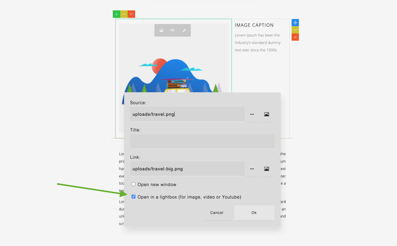
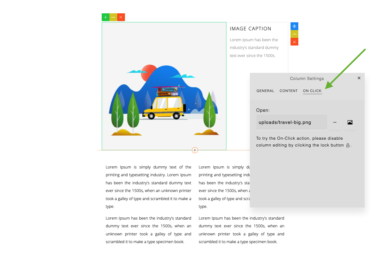
Also in the Column Settings dialog, the ‘On Click’ tab will be visible.
61
To try the On-Click action, you will need to lock the column.
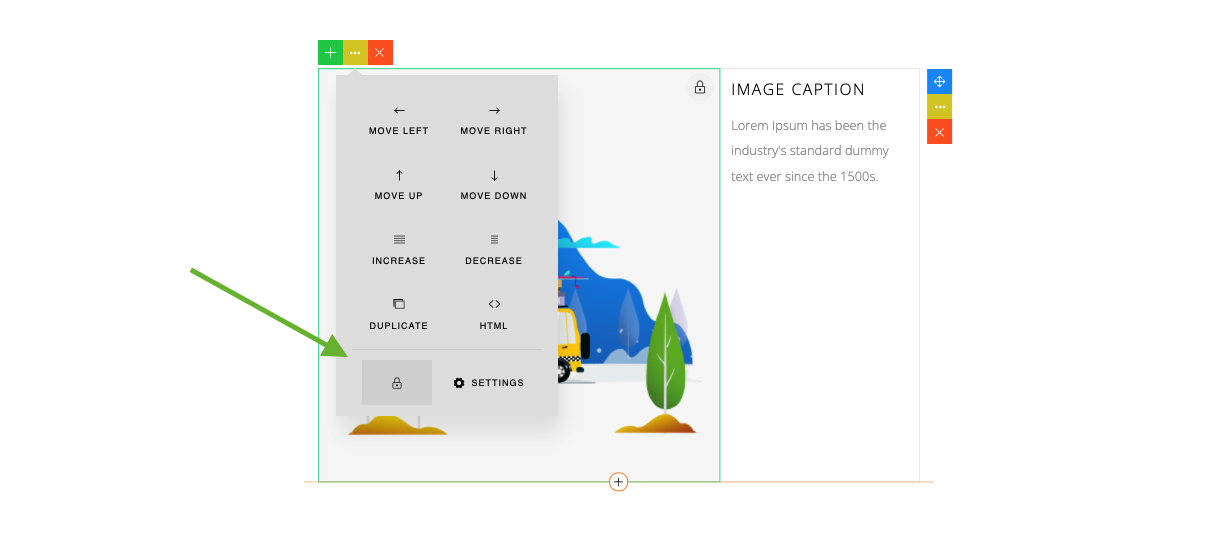
Then, when you click the link or column, the lightbox will be opened (a locked column will disable the editing).

62
In Production
In production (for viewing content), you will need to include a Lightbox script as follow:
The css:
<link href="assets/scripts/lightbox/lightbox.css" rel="stylesheet" type="text/css" />
<script src="assets/scripts/lightbox/lightbox.js"></script>
<script>
    lightbox.init();
</script>
And the js:
63
The color picker shows some default color list.
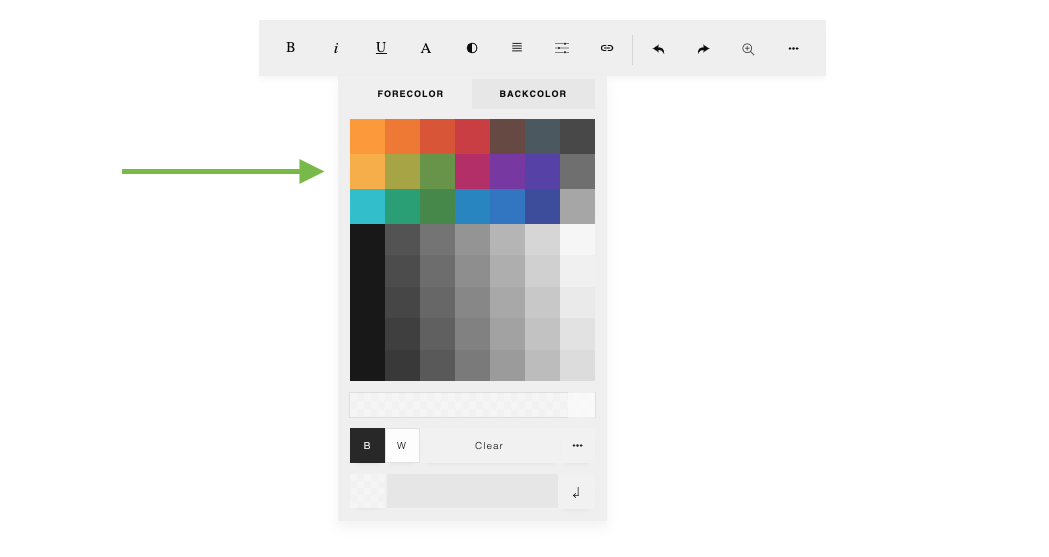
To configure the colors:
const builder = new ContentBuilder({
    container: '.container',
    colors: ["#ff8f00", "#ef6c00", "#d84315", "#c62828", "#58362f", "#37474f", "#353535",
        "#f9a825", "#9e9d24", "#558b2f", "#ad1457", "#6a1b9a", "#4527a0", "#616161",
        "#00b8c9", "#009666", "#2e7d32", "#0277bd", "#1565c0", "#283593", "#9e9e9e"],
});
64
Custom tags are commonly used in a CMS for adding dynamic element within the content by replacing the tags in production (not during editing). Here is an example:
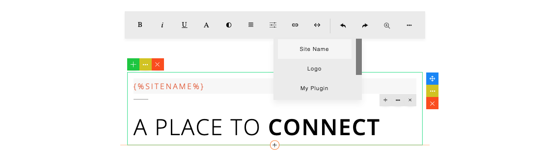
To configure this feature:
const builder = new ContentBuilder({
    container: '.container',
    customTags: [["Site Name", "{%SITENAME%}"],
        ["Logo", "{%LOGO%}"],
        ["My Plugin", "{%MY_PLUGIN%}"],
});
65
Some modals open with animation. For example, when deleting a row, a confirmation modal shows with zoom animation on the content. To enable or disable this feature:
const builder = new ContentBuilder({
    container: '.container',
    animateModal: false, // default: true
});
You can pass any custom value to the server. In a CMS application, you can pass, for example, a user id or session id, etc.
The value will be passed when an image is submitted to the server using the Form method. Note that in the AJAX post method, you may not need this feature as you can post any data during the AJAX post. On the server, the image handler can use this value to decide where to save the image for each user. This is more towards customizing your application.
To specify a custom value:
const builder = new ContentBuilder({
    container: '.container',
    customval: 200 // or any value
});
66
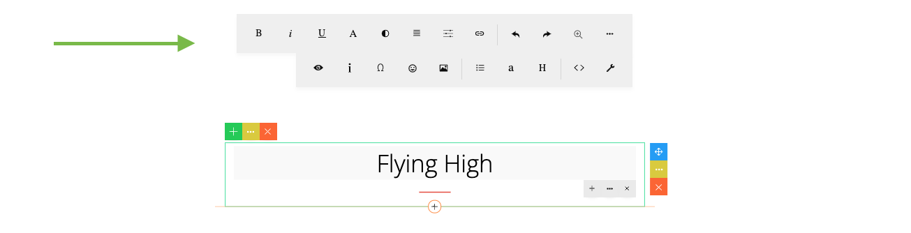
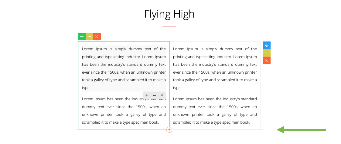
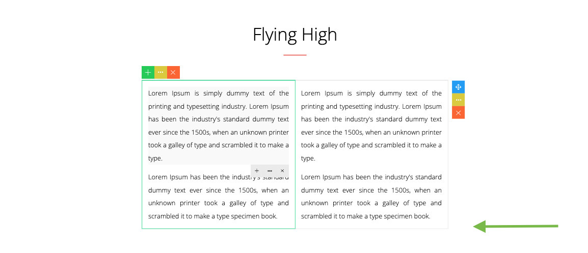
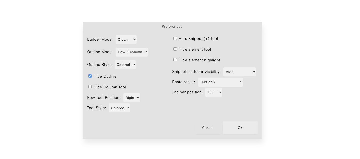
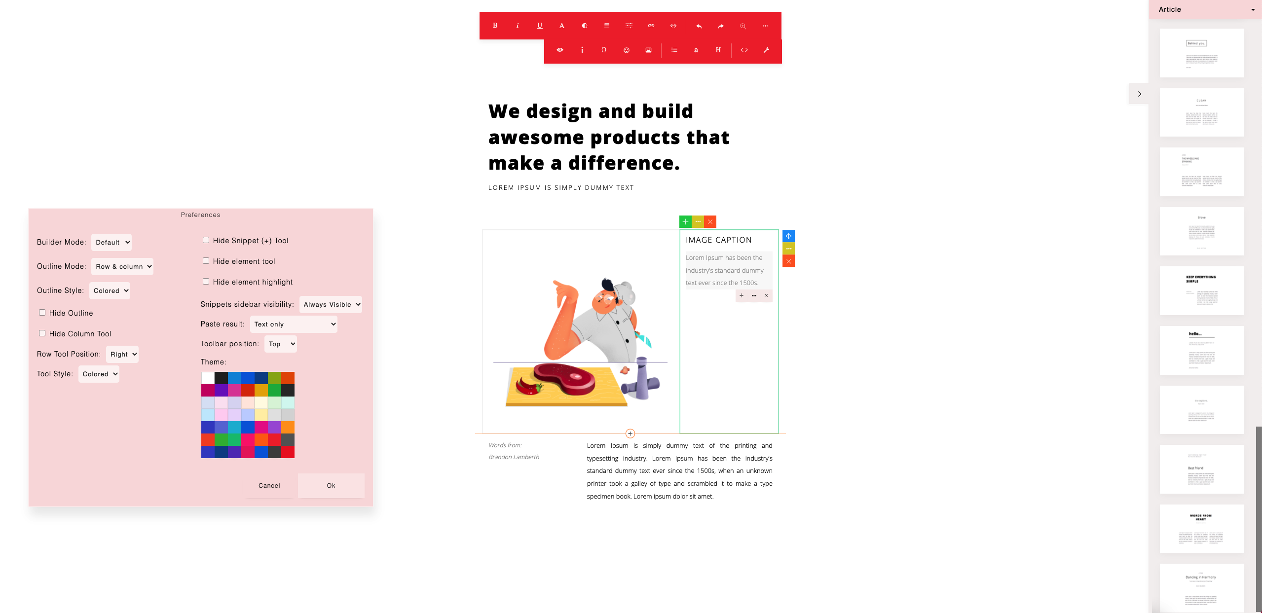
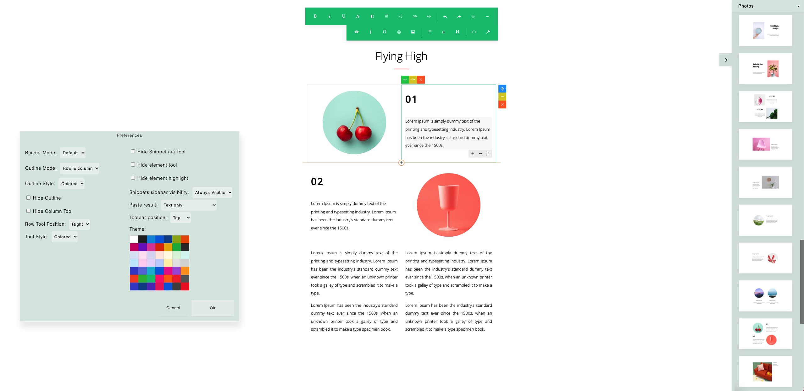
The preferences dialog allows you to choose your editing preferences. You can hide unwanted tools, choose the toolbar placement or even make the interface clean to write without distraction.
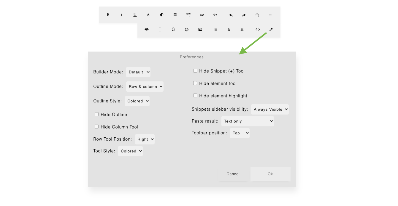
Preference options are explained below.
67
You can choose: Default, Minimal or Clean.
Default
The default mode shows all available buttons on the row & column tool.

68
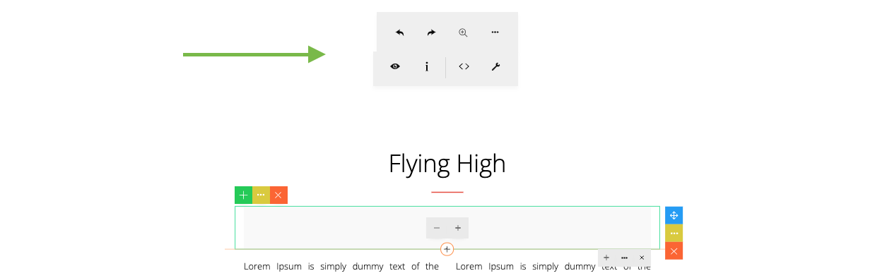
Minimal
The minimal mode simplifies the row & column tool.
As seen in the row tool, a new ‘Grid’ button is shown. Clicking on the button will show a small grid tool.
69
Clean
This option will further simplify the interface, by showing only the ‘Grid’ button.
To set the Builder Mode in code:
const builder = new ContentBuilder({
    container: '.container',
    builderMode: 'clean'
});
Values:
70
You can choose: Row & Column, Row Only.
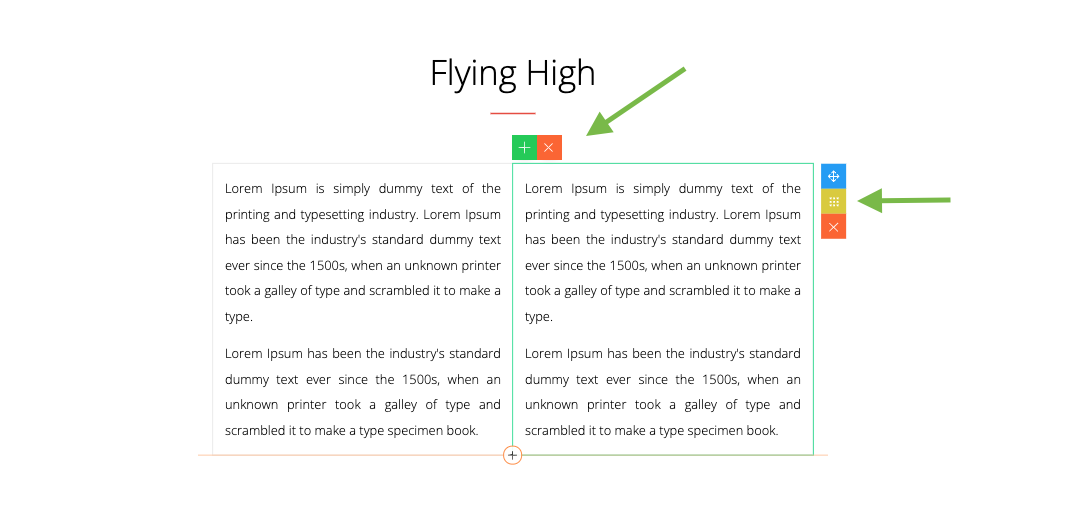
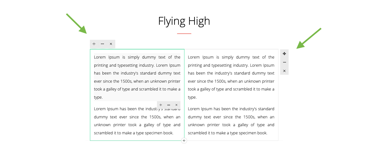
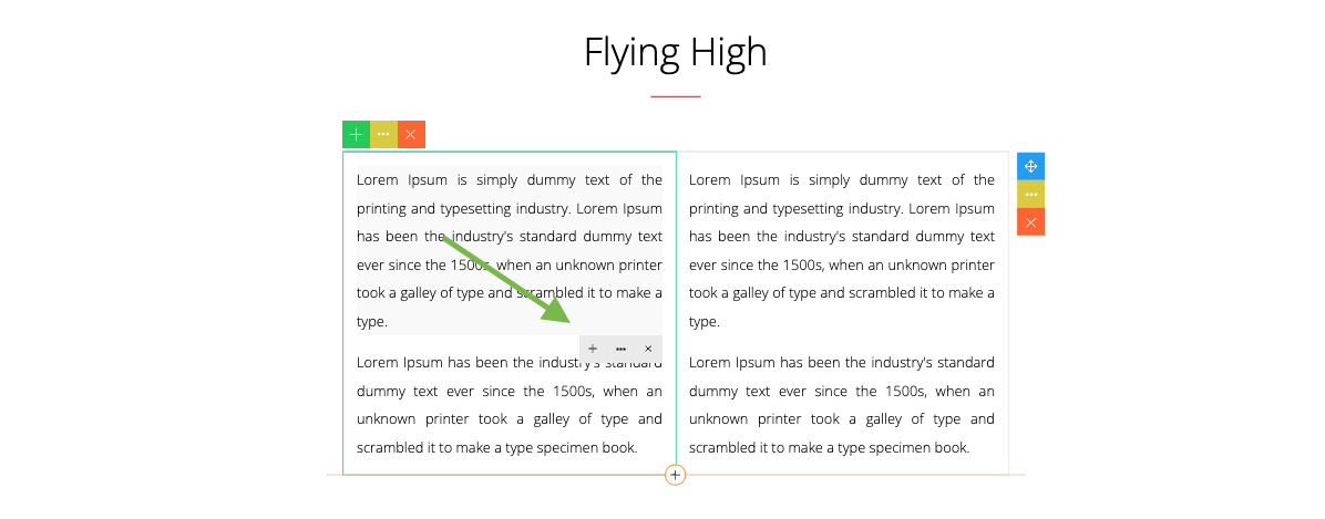
Row & Column
Shows an outline on active row and column.
71
Row Only
Shows an outline on active row only.
To set the Outline Mode in code:
const builder = new ContentBuilder({
    container: '.container',
    outlineMode: 'row'
});
Values:
72
You can choose: Colored, Gray.
Here the outline is set to gray.
To set the Outline Style in code:
const builder = new ContentBuilder({
    container: '.container',
    outlineStyle: 'grayoutline'
});
Values:
73
If checked, there will be no outline on active row or column.
To hide the Outline in code:
const builder = new ContentBuilder({
    container: '.container',
    rowcolOutline: false // outline will be hidden
});
Values:
74
If checked, column tool will not be visible on active column.
To hide the Column Tool in code:
const builder = new ContentBuilder({
    container: '.container',
    columnTool: false // column tool will be hidden
});
Values:
75
You can choose: Left, Right.
Here the position is set Left.
To set the Row Tool Position in code:
const builder = new ContentBuilder({
    container: '.container',
    rowTool: 'left' // positioned on left
});
Values:
76
You can choose: Colored, Mono.
Here the tool style is set to Mono.
To set the Tool Style in code:
const builder = new ContentBuilder({
    container: '.container',
    toolStyle: 'gray' // = Gray or Mono
});
Values:
77
If checked, the Add (+) Snippet button will be hidden.
Here the Add (+) Snippet button is visible.
To hide the Snippet (+) Tool in code:
const builder = new ContentBuilder({
    container: '.container',
    snippetAddTool: false // Snippet (+) tool will be hidden
});
And here the Add (+) Snippet button is hidden.
Values:
78
If checked, the element tool will be hidden.
Here the element tool is visible.
To hide the Element Tool in code:
const builder = new ContentBuilder({
    container: '.container',
    elementTool: false // Element tool will be hidden
});
And here the element tool is hidden.

Values:
79
If checked, there will be no active element highlight.
Here the element highlight is visible.
To hide the Element Highlight in code:
const builder = new ContentBuilder({
    container: '.container',
    elementHighlight: false // Element highlight will be hidden
});
And here the element highlight is not visible.
Values:
80
You can choose: Auto, Always Visible.
Normally, the snippet sidebar will be automatically closed during editing. If set to ‘Always Visible’, the snippet sidebar will stay visible.
To set the Snippet Sidebar Visibility in code:
const builder = new ContentBuilder({
    container: '.container',
    snippetDisplay: 'visible' // stay visible
});
Values:
81
const builder = new ContentBuilder({
    container: '.container',
    paste: 'text'
});
Values:
You can choose:
This is a behavior you can choose when you paste copied content from another source, for example, from a Word document.
To set the Paste Result in code:
82
You can choose: Top, Left, or Right.
If the position is set to Left, the toolbar will be shown on the left.
If the position is set to Right, the toolbar will be shown on the right.
const builder = new ContentBuilder({
    container: '.container',
    toolbar: 'left'
});
To set the Toolbar Position in code:
Values:
83
builder.viewConfig();
Preference dialog can be opened programmatically using:
84
Normaly, when you click Ok on the Preferences dialog, your chosen settings will be automatically saved (on browser local storage). So the next time you open the builder, you can still work with your chosen preferences.
To force the builder to not use the saved preferences, you can use:
const builder = new ContentBuilder({
    container: '.container',
    clearPreferences: true,
});
Here is the result.
85
As an example, here are the settings you can choose to make the builder clean.
In this example, the Builder Mode is set to ‘Clean’ and the Hide Outline is checked.
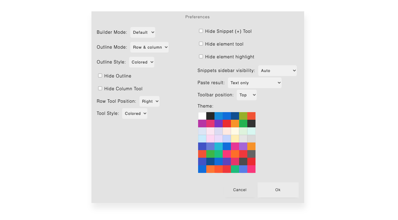
To enable theme selection (with complete list of themes):
const builder = new ContentBuilder({
    container: '.container',
	themes: [
		['#ffffff','',''],
		['#282828','dark','contentbuilder/themes/dark.css'],
		['#0088dc','colored','contentbuilder/themes/colored-blue.css'],
		['#006add','colored','contentbuilder/themes/colored-blue6.css'],
		['#0a4d92','colored','contentbuilder/themes/colored-darkblue.css'],
		['#96af16','colored','contentbuilder/themes/colored-green.css'],
		['#f3522b','colored','contentbuilder/themes/colored-orange.css'],

		['#b92ea6','colored','contentbuilder/themes/colored-magenta.css'],
		['#e73171','colored','contentbuilder/themes/colored-pink.css'],
		['#782ec5','colored','contentbuilder/themes/colored-purple.css'],
		['#ed2828','colored','contentbuilder/themes/colored-red.css'],
		['#f9930f','colored','contentbuilder/themes/colored-yellow.css'],
		['#13b34b','colored','contentbuilder/themes/colored-green4.css'],
		['#333333','colored-dark','contentbuilder/themes/colored-dark.css'],

		['#dbe5f5','light','contentbuilder/themes/light-blue.css'],
		['#fbe6f2','light','contentbuilder/themes/light-pink.css'],
		['#dcdaf3','light','contentbuilder/themes/light-purple.css'],
		['#ffe9e0','light','contentbuilder/themes/light-red.css'],
		['#fffae5','light','contentbuilder/themes/light-yellow.css'],
		['#ddf3dc','light','contentbuilder/themes/light-green.css'],
		['#c7ebfd','light','contentbuilder/themes/light-blue2.css'],

		['#ffd5f2','light','contentbuilder/themes/light-pink2.css'],
		['#eadafb','light','contentbuilder/themes/light-purple2.css'],
		['#c5d4ff','light','contentbuilder/themes/light-blue3.css'],
		['#ffefb1','light','contentbuilder/themes/light-yellow2.css'],
		['#fefefe','light','contentbuilder/themes/light-gray3.css'],
		['#e5e5e5','light','contentbuilder/themes/light-gray2.css'],
		['#dadada','light','contentbuilder/themes/light-gray.css'],
Each theme definition consists of:
86
		['#3f4ec9','colored','contentbuilder/themes/colored-blue2.css'],
		['#6779d9','colored','contentbuilder/themes/colored-blue4.css'],
		['#10b9d7','colored','contentbuilder/themes/colored-blue3.css'],
		['#006add','colored','contentbuilder/themes/colored-blue5.css'],
		['#e92f94','colored','contentbuilder/themes/colored-pink3.css'],
		['#a761d9','colored','contentbuilder/themes/colored-purple2.css'],
		['#f9930f','colored','contentbuilder/themes/colored-yellow2.css'],

		['#f3522b','colored','contentbuilder/themes/colored-red3.css'],
		['#36b741','colored','contentbuilder/themes/colored-green2.css'],
		['#00c17c','colored','contentbuilder/themes/colored-green3.css'],
		['#fb3279','colored','contentbuilder/themes/colored-pink2.css'],
		['#ff6d13','colored','contentbuilder/themes/colored-orange2.css'],
		['#f13535','colored','contentbuilder/themes/colored-red2.css'],
		['#646464','colored','contentbuilder/themes/colored-gray.css'],

		['#3f4ec9','dark','contentbuilder/themes/dark-blue.css'],
		['#0b4d92','dark','contentbuilder/themes/dark-blue2.css'],
		['#006add','dark','contentbuilder/themes/dark-blue3.css'],
		['#5f3ebf','dark','contentbuilder/themes/dark-purple.css'],
		['#e92f69','dark','contentbuilder/themes/dark-pink.css'],
		['#4c4c4c','dark','contentbuilder/themes/dark-gray.css'],
		['#ed2828','dark','contentbuilder/themes/dark-red.css'],

		['#006add','colored','contentbuilder/themes/colored-blue8.css'],
		['#ff7723','colored','contentbuilder/themes/colored-orange3.css'],
		['#ff5722','colored','contentbuilder/themes/colored-red5.css'],
		['#f13535','colored','contentbuilder/themes/colored-red4.css'],
		['#00bd79','colored','contentbuilder/themes/colored-green5.css'],
		['#557ae9','colored','contentbuilder/themes/colored-blue7.css'],
		['#fb3279','colored','contentbuilder/themes/colored-pink4.css'],
	],
});
87
When enabled, the theme selection will be visible on the Preferences dialog.
88
Example themes:
89
To load a specific theme programmatically, you can use:
builder.setUIColor('colored','contentbuilder/contentbuilder-red.css');
For light theme:
builder.setUIColor('');
For dark theme:
builder.setUIColor('dark','contentbuilder/contentbuilder-dark.css');
90
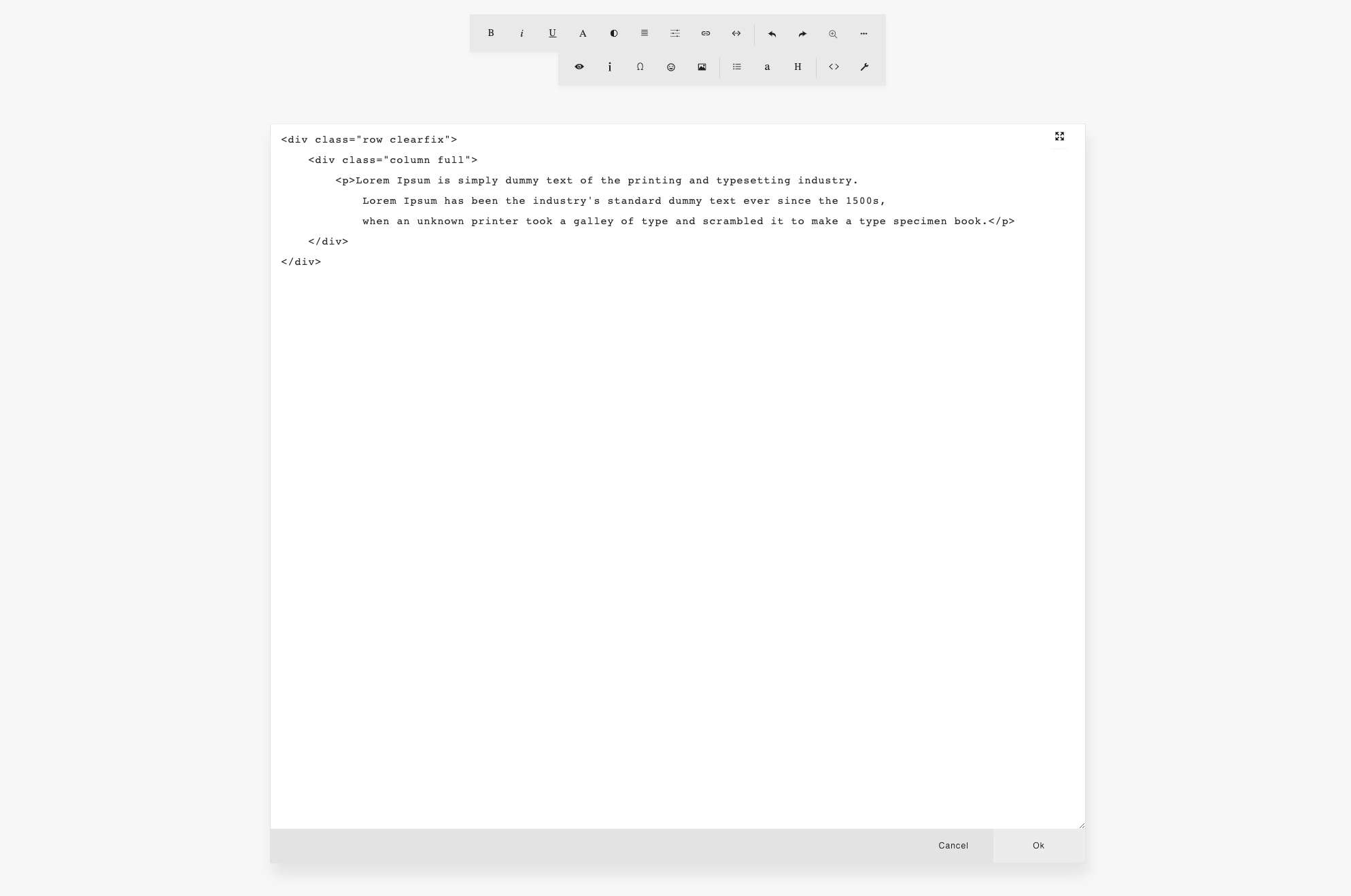
You can edit the HTML code of your content with or without syntax highlighting.
To configure:
const builder = new ContentBuilder({
    container: '.container',
    htmlSyntaxHighlighting: true,
});
With syntax highlighting:
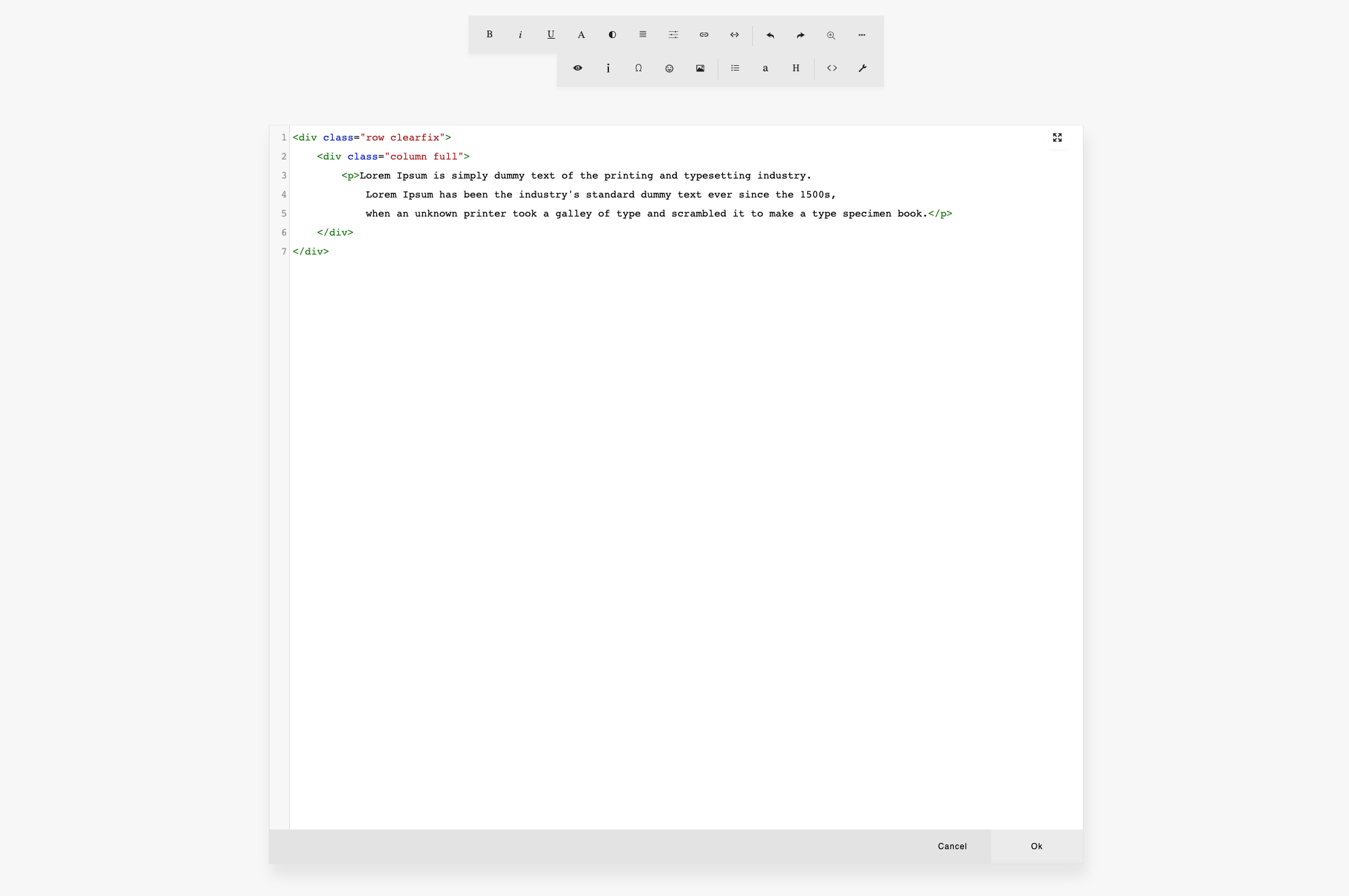
Without syntax highlighting:
91
builder.viewHtml();
To open HTML code editor programmatically:
The column HTML editor button is shown on the column tool popup. If disabled, the button will not be visible.
To disable:
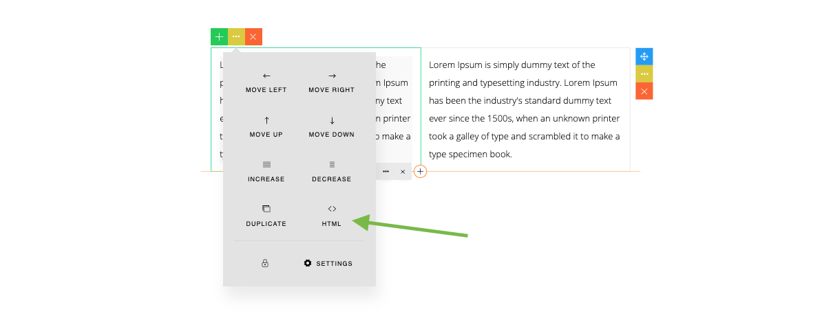
const builder = new ContentBuilder({
    container: '.container',
    columnHtmlEditor: false,
});
const builder = new ContentBuilder({
    container: '.container',
    rowHtmlEditor: false,
});
The row HTML editor button is shown on the row tool popup. If disabled, the button will not be visible.
To disable:
92
To load HTML content programmatically, you can pass your HTML content in the loadHtml() method:
builder.loadHtml(html);
To paste HTML content programmatically, you can pass your HTML content in the pasteHtmlAtCaret() method:
builder.pasteHtmlAtCaret(html);
You will need to place the cursor on the content where you want to paste the HTML.
93
By default, when you press CMD-A or CTRL-A, you will select the current element where cursor is placed (not selecting all elements on the entire column). This behavior is defined by the elementSelection parameter:
const builder = new ContentBuilder({
    container: '.container',
    elementSelection: true,
});
If elementSelection is set to false, then the selection will go to the entire column.
94
To insert custom HTML snippet programmatically, you can pass your HTML snippet in the addSnippet() method:
builder.addSnippet(`
    <div class="row">
        <div class="column">
            <h3>Hello World!</h3>
        </div>
    </div>
`);
The HTML snippet must follow the grid structure as explained in chapter ‘Your Own Snippets‘.
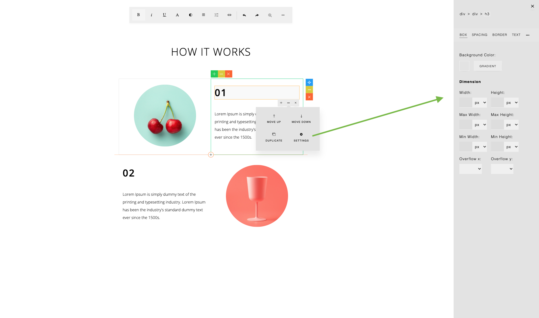
ContentBuilder.js provides you with a style panel to format the selected element. Click the Settings button on the element tool popup to open the Style panel.
const builder = new ContentBuilder({
    container: '.container',
    elementEditor: false,
});
To disable the Style panel button:
95
You can change the editable area zoom by clicking the zoom icon on the toolbar and use the zoom slider.

To specify the default zoom, use:
const builder = new ContentBuilder({
    container: '.container',
    zoom: 0.8, // value: 0.5 to 1
});
When you change the zoom size, the value is saved automatically (on browser’s local storage). So next time you open the builder, the previously chosen zoom will be used (not the default zoom value).
Some event callbacks you can use when the zoom is changed.
const builder = new ContentBuilder({
    container: '.container',
    onZoomStart: function() { ... },
    onZoom: function(scale) { ... },
    onZoomEnd: function(scale) { ... },
});
96
There are two types of toolbars: Main toolbar & Element toolbar.
Main Toolbar
Main toolbar is displayed when a text element is selected.

When you click the … (more) button, a second row of buttons will be displayed
To configure the main toolbar, use the buttons parameter, and to configure the second row of the toolbar, use the buttonsMore parameter:
const builder = new ContentBuilder({
    container: '.container',
    buttons: ['bold', 'italic', 'underline', 'formatting', 'color', 'align', 'textsettings',
        'createlink', 'tags', '|', 'undo', 'redo', 'zoom', 'more'],
    buttonsMore: ['icon', 'image', '|', 'list', 'font', 'formatpara', '|', 'html', 'preferences'],
});

Note: Use ‘|’ for separator.
97
Allowed buttons for the main toolbar:
98
Element Toolbar
Element toolbar is displayed when a non-text element is selected, for example, when you select an image.
The default element toolbar shows the buttons as seen below:

When you click the … (more) button, a second row of buttons will be displayed:
To configure the element toolbar, use the elementButtons parameter, and to configure the second row buttons use the elementButtonsMore parameter:
const builder = new ContentBuilder({
    container: '.container',
    elementButtons: ['left', 'center', 'right', 'full' , 'undo', 'redo', 'zoom', 'more'],
    elementButtonsMore: ['|', 'html', 'preferences'],
});

99
Allowed buttons for the element toolbar:
Plugin Buttons
As you can see on both the main toolbar and the element toolbar, there are some additional buttons that come from installed plugins (on the left side of the second toolbar).


100
The default installed plugins are:
If plugin buttons are defined in the toolbar (the plugin name found in buttons, buttonsMore, elementButtons or elementButtonsMore), then the plugin buttons will not be automatically added on the left side of the second toolbar.
Please see Plugins section for more info on plugins.
Example: if you don’t want to use the “More” button
const builder = new ContentBuilder({
    container: '.container',
    buttons: ['bold', 'italic', 'undo', 'redo', 'zoom', 'preview'],
    buttonsMore: [],
    elementButtons: ['undo', 'redo', 'zoom', 'preview'],
    elementButtonsMore: [],
    plugins: [
        { name: 'preview', showInMainToolbar: true, showInElementToolbar: true },
    ],
    pluginPath: 'contentbuilder/',
});
As seen on the code, we install only the ‘preview’ plugin. You will need to define the ‘preview’ button on the toolbar. Then you set the second row toolbars to empty. Here is the result.

101
Or, if you are not using any plugins, use:
const builder = new ContentBuilder({
    container: '.container',
    buttons: ['bold', 'italic', 'undo', 'redo', 'zoom'],
    buttonsMore: [],
    elementButtons: ['undo', 'redo', 'zoom'],
    elementButtonsMore: [],
    disableConfig: true
});
Here is the result.

102
Icon Toolbar
Another toolbar that is used is the icon toolbar which is displayed when an icon is selected.
The icon toolbar shows the buttons as seen below:
To configure the icon toolbar, use the iconButtons parameter, and to configure the second row buttons, use the iconButtonsMore parameter:
const builder = new ContentBuilder({
    container: '.container',
    iconButtons: ['icon', 'color','textsettings', 'createLink','|', 'undo', 'redo', 'zoom', 'more'],
    iconButtonsMore: ['|', 'html', 'preferences'],
});
103
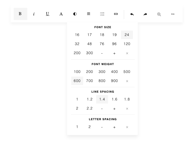
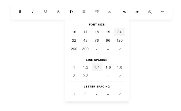
With Text Settings on the toolbar, you can adjust font size, font weight, line spacing (line height) and letter spacing.
104
const builder = new ContentBuilder({
    container: '.container',
    simpleTextSettings: true,
});
If the Bold button on the toolbar is sufficient for you, you can hide the font weight settings by setting the simpleTextSettings parameter to true.
From the toolbar, you can perform an undo or redo operation. You can also perform an undo or redo action programmatically using:
or:
builder.undo();
builder.redo();
Some useful parameters to define an event callback function:
onRender
Triggered when content structure is changed, for example, when a new snippet is added. If you monitor your content to apply a certain process or add a certain behavior, you can re-run your process here.
const builder = new ContentBuilder({
    container: '.container',
    onRender: function() { ... }
});
105
onChange
Triggered when content is changed.
const builder = new ContentBuilder({
    container: '.container',
    onChange: function() { ... }
});
onContentClick(event)
Triggered when content is clicked.
const builder = new ContentBuilder({
    container: '.container',
    onContentClick: function(event) { ... }
});
To destroy the builder plugin:
builder.destroy();
106
ContentBuilder.js requires some assets located in the assets/ folder. For example, there are icons, optional scripts for module, etc.
If you want to change the location of the assets/ folder, you can change the assetPath value:
The assetPath value is required by the icons and optional scripts for module.
There are some folders inside the assets/ folder:
assets/fonts/
This folder contains thumbnails for the font selection. You can change the location of this folder by changing the value of the fontAssetPath parameter:
const builder = new ContentBuilder({
    container: '.container',
    assetPath: 'assets/'
});
const builder = new ContentBuilder({
    container: '.container',
    fontAssetPath: 'assets/fonts/'
});
107
assets/minimalist-blocks/
This is the location of the snippet file and its assets. To change the location:
You may also need to use the snippetPathReplace parameter. Please see the usage in the Snippets section in this documentation.
assets/modules/
This is the location of the modules. To change the location:
const builder = new ContentBuilder({
    container: '.container',
    snippetUrl: 'assets/minimalist-blocks/content.js', // Snippet file
    snippetPath: 'assets/minimalist-blocks/',  // Location of snippets' assets
});
const builder = new ContentBuilder({
    container: '.container',
    modulePath: 'assets/modules/'
});
108
const builder = new ContentBuilder({
    container: '.container',
	pluginPath: 'contentbuilder/',
});
Another location you may want to change is the plugins/ folder location, which contains plugin-related files.
contentbuilder/plugins/
Here you just need to specify the pluginPath parameter with the folder where the plugins/ folder is located. The default value is the contentbuilder/ folder. To change the location:
109
© 2026 InnovaStudio
 Store
Store