InnovaStudio
Documentation
ContentBox.js is a web page designer. It uses ContentBuilder.js as its HTML editor with added features for page designing. You can use it to create your own CMS or online site builder.
2
.………………..… 3
…………………………………………………………………………………. 6
..……………………………….……………………………………………………………………… 9
..…………………………………………………………………………….. 11
…..……..……………………. 12
………………………………… 13
………………………………… 18
………………..…………………………..………..………………………………………… 20
………………………………………………………………………………………………… 24
…………………………………………………………………………….… 30
…………………………. 32
……………….………………… 33
..……………………….…………………………………………………………………….. 44
……..……………………………………………………………………. 47
……..………………………………….………………………………………… 49
…………………………………………………………………………………… 50
……………………… 51
……………………………….……………..… 53
ContentBox.js is written in pure Javascript (ES6) so you can use it in most situations. Sample use in simple HTML, Node.js, PHP, React and Vue projects are included.
React and Vue project examples are provided in separate downloads in the user area.
3
To run the HTML example, open using your browser: public/example.html from localhost or from your server.
More examples:
– example-2.html
– example.php
– example-bootstrap.html
– example-tailwind.html
– example-s3.php
– more..
1
2
Go to the project folder and install the dependencies.
cd contentbox
npm install
Run the example:
npm start
A browser will be opened running the example. The example uses Node.js for handling file/image upload.
4
example.html (with custom topbar)
5
example-2.html (without custom topbar)
Include the ContentBuilder css files:
<link href="assets/minimalist-blocks/content.css" rel="stylesheet" type="text/css" /> <!-- for snippets -->
<link href="contentbuilder/contentbuilder.css" rel="stylesheet" type="text/css" />
and the ContentBox css file:
<link href="contentbox/contentbox.css" rel="stylesheet" type="text/css" />
Step 1
CSS
6
Include as Web Library
<script src="contentbox/contentbox.min.js" type="text/javascript"></script>
And import into your project:
import ContentBox from '@innovastudio/contentbox';
Step 2
JS
Or Install with NPM
npm install @innovastudio/contentbox
7
Note: the npm version is regularly updated with the latest features and fixes. Consequently, this latest version requires the most recent CSS or assets. Please ensure that you have downloaded the latest version package from the user area.
<link href="box/box-flex.css" rel="stylesheet" type="text/css" />
For rendering content, ContentBox built-in framework are also needed.
<script src="box/box-flex.js" type="text/javascript">
8
Asset files (eg. template or snippet files) are also needed to run the ContentBox. They are located in the assets folder in the package.
Note: location of asset related files are flexible and can be configured. For example, you can move the asset files on different server (eg. CDN server).
Step 3
Check the Asset Files
Include the built-in framework for rendering content
 <div class="is-wrapper">
 </div>
const builder = new ContentBox({
    wrapper: '.is-wrapper',
    controlPanel: true,
    iframeSrc: 'blank.html'
    /* other options */
});
9
controlPanel (default: false)
By setting the controlPanel to true, ContentBox.js will use the new enhanced side panel for editing. We recommend setting this parameter to true.
iframeSrc (default: blank.html)
By specifying the iframeSrc parameter, ContentBox.js will use a resizable iframe for editing, enabling you to check the content on different screen sizes. We recommend specifying this parameter.
The ‘blank.html’ page is provided in the ‘public/’ folder. If you’re using a specific framework, such as Bootstrap, you can include the Bootstrap CSS in this ‘blank.html’ page.
To get the edited content:
1. Get the HTML content
let html = builder.html();
2. Get the styles
let mainCss = builder.mainCss(); // Returns the default typography style for the page.
let sectionCss = builder.sectionCss(); // Returns the typography styles for specific sections on the page
Then you can do anything with the content, for example, posting it to the server for saving, etc.
In production, the saved HTML content should be rendered with the styles.
10
Try the example implementation by opening ‘public/example.html‘ in your browser
(access it from localhost).
11
Note:
ContentBox.js is a client-side JavaScript library (server-independent). The package includes some server-side files (PHP, Node.js) for providing implementation examples only.
Content consists of HTML and its styles (e.g. typography styles/css includes). As explained previously, you get the edited content using the following methods:
1. To get the HTML
let html = builder.html();
2. To get the styles
let mainCss = builder.mainCss(); // Returns the default typography style for the page.
let sectionCss = builder.sectionCss(); // Returns the typography styles for specific sections on the page
You can save the HTML and its styles above into a database. And when you need to load the content back for editing, use the loadHtml() and loadStyles methods.
builder.loadHtml(html);
builder.loadStyles(mainCss, sectionCss);
12
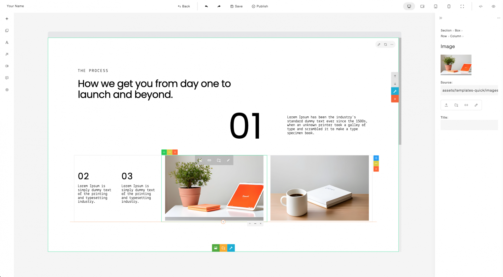
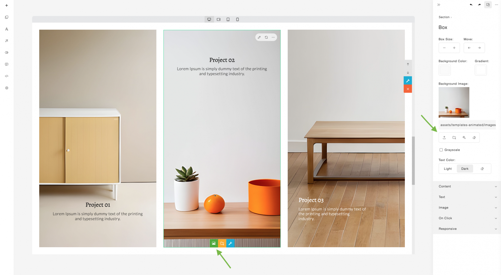
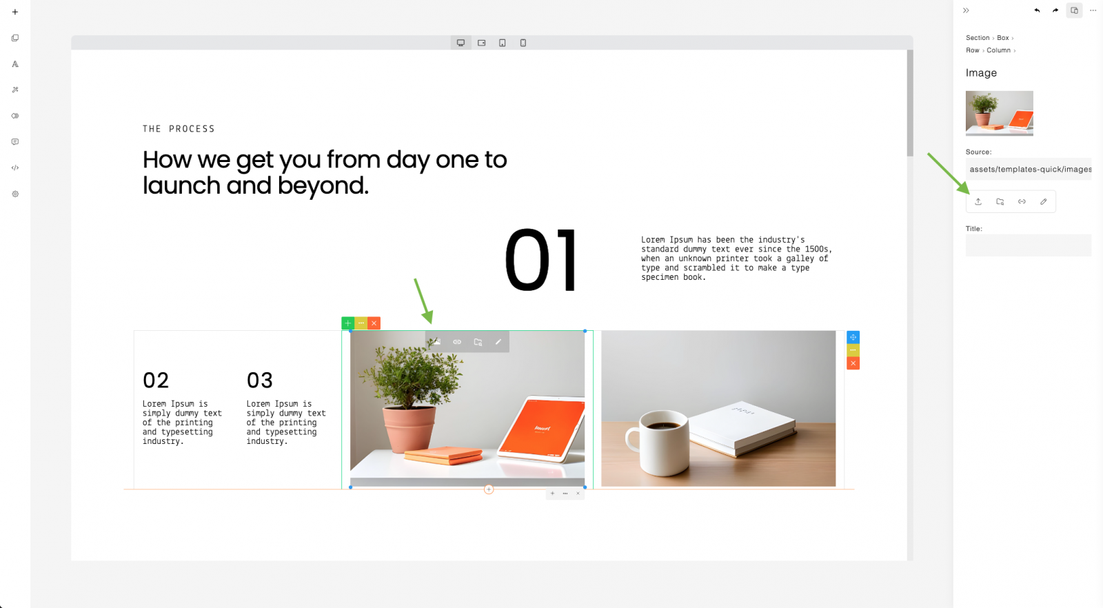
You can add images into your page as a background box (cover) or as an embedded image. Uploading images and other media types (such as video and audio) requires server-side handling. Examples of server-side uploads in PHP and Node.js are provided.
13
14
When using the upload feature in ContentBox, different events are triggered depending on the specific ContentBox feature being used. These events include:
You can customize the handling of each ContentBox feature by providing corresponding callback functions for these events.
15
Example:
const builder = new ContentBox({
    wrapper: '.is-wrapper',

    /* options */

    onUploadCoverImage: (e) => {
        uploadFile(e, (response)=>{
            const uploadedFileUrl = response.url; // get saved image url
            builder.boxImage(uploadedFileUrl); // apply
        });
    },
    onImageUpload: (e)=>{
        uploadFile(e, (response)=>{
            const uploadedFileUrl = response.url;
            builder.returnUrl(uploadedFileUrl);
        });
    },
    onVideoUpload: (e)=>{
        uploadFile(e, (response)=>{
            const uploadedFileUrl = response.url;
            builder.returnUrl(uploadedFileUrl);
        });
    },
You can customize the file upload functionality by providing a callback function, in this case, uploadFile(). This function manages the file upload process, and upon successful completion, it provides the URL of the saved image. You can then utilize this URL to apply the image to the content. For instance, when applying a box background image, use the boxImage(url) method. For embedding other types of files, employ the returnUrl(url) method.
16
17
    onAudioUpload: (e)=>{
        uploadFile(e, (response)=>{
            const uploadedFileUrl = response.url;
            builder.returnUrl(uploadedFileUrl);
        });
    },
    onMediaUpload: (e)=>{
        uploadFile(e, (response)=>{
            const uploadedFileUrl = response.url;
            builder.returnUrl(uploadedFileUrl);
        });
    },
    onFileUpload: (e)=>{
        uploadFile(e, (response)=>{
            const uploadedFileUrl = response.url;
            builder.returnUrl(uploadedFileUrl);
        });
    },
});
In the example, the file is uploaded to an endpoint: /upload. PHP and Node.js examples are provided in the project package for server-side handling.
function uploadFile(e, callback) {
    const selectedFile = e.target.files[0];
    const formData = new FormData();
    formData.append('file', selectedFile);
    fetch('/upload', {
        method: 'POST',
        body: formData,
    })
    .then(response=>response.json())
    .then(response=>{
        if(callback) callback(response);
    });
}
Some image embeddings use the base64 format. All these images need to be automatically saved into files on the server. For this purpose, use the saveImages() method. Once the base64 image saving is complete, you can then proceed to save the content.
function save() {
    builder.saveImages('', ()=>{
        // All base64 image saving is complete. You can now proceed to save the content.

        // Get the content and its styles
        let html = builder.html();
        let mainCss = builder.mainCss();
        let sectionCss = builder.sectionCss();
        const data = {
            html: html,
            mainCss: mainCss,
            sectionCss: sectionCss,
        };

        // Save to the server
        fetch('/save', {
            method:'POST',
            body: JSON.stringify(data),
            headers: {
                'Content-Type': 'application/json',
            }
        })
18
        .then(response=>response.json())
        .then(response=>{
            if(response.error) {
                console.log(response.error);
            }
        });
    }, (img, base64, filename)=>{
        // Uploading all base64 embedded images
        const reqBody = { image: base64, filename: filename };
        fetch('/uploadbase64', {
            method:'POST',
            body: JSON.stringify(reqBody),
            headers: {
                'Content-Type': 'application/json',
            }
        })
        .then(response=>response.json())
        .then(response=>{
            if(!response.error) {
                const uploadedImageUrl = response.url;
                img.setAttribute('src', uploadedImageUrl); // Update image src
            }
        });
    });
}
19
In the example, the image is uploaded to an endpoint: /uploadbase64. PHP and Node.js examples are provided in the project package for server-side handling.
html()
Returns the HTML content of the editable area.
mainCss()
Returns the main style of the content.
sectionCss()
Returns the section style of the content.
loadHtml(html)
Loads HTML content programmatically.
loadStyles(mainCss, sectionCss)
Loads content styles programmatically.
undo()
Undoes the last action.
redo()
Redoes the previously undone action.
20
saveImages(”, onComplete, onImageSave)
Saves base64 images.
21
builder.saveImages(
  "",
  () => {
    // on complete
  },
  (img, base64, filename) => {
    // save base64 image
    // img: image element
    // base64: image data
    // filename: image filename
  }
);
Note: Please leave the first argument empty as it is used for the old upload method.
For more information. please refer to the ‘Saving Base64 embedded image’ section.
destroy()
Destroys the ContentBox instance.
viewHtml()
Opens the HTML view/code editor.
22
openAnimationPanel()
Opens the Animation panel.
openAnimationTimeline()
Opens the Animation timeline editor.
openAIAssistant()
Opens the AI Assistant panel.
openSettings()
Opens the settings popup.
setScreenMode(screenMode)
Sets the content screen size. Possible values:
– desktop
– tablet-landscape
– tablet
– mobile
– fullview
Example:
builder.setScreenMode('desktop');
23
toggleDevice()
Toggles between full view and resized screen.
addButton(json)
Adds a custom button to the left sidebar.
Example:
builder.addButton({
    'pos': 2, // button position
    'title': 'Undo',
    'html': '',
    'onClick': ()=>{
        builder.undo();
    }
});
boxImage(url)
Applies a box background image.
returnUrl(url)
Embeds media (image, video, etc).
htmlCheck()
Gets HTML content for checking and comparing changes.
wrapper (default: ‘.is-wrapper’)
Selector for the editable area.
const builder = new ContentBox({
    wrapper: '.is-wrapper',
    /* options */
});
24
The ‘preview.html’ file, located in the ‘public’ folder, is provided for viewing the edited page result without the builder.
previewURL (default: ‘preview.html’)
Helper page for previewing page.
const builder = new ContentBox({
    wrapper: '.is-wrapper',
    previewURL: 'preview.html',
    /* options */
});
controlPanel (default: false)
Enables the new enhanced panel.
iframeSrc (default: not set)
Specifies the iframe source for resizable editing.
screenMode (default: ‘desktop’)
Default content resize mode. Possible value:
– desktop
– tablet-landscape
– tablet
– mobile
– fullview
Example:
25
const builder = new ContentBox({
    /* options */
    screenMode: 'fullview',
});
topSpace (default: false)
Adds an empty space on top of the builder. This option is useful when you have a custom top bar on the builder.
An example of custom topbar is provided in ‘example.html’ in the project package.
iframeCentered (default: false)
When ‘iframeCentered’ is set to ‘true,’ the resized content is centered. The default behavior, when set to ‘false,’ is top-aligned.
htmlButton (default: true)
Shows/hides HTML button on the left sidebar.
undoRedoButtons (default: true)
Shows/hides undo redo buttons on the panel.
toggleDeviceButtons (default: true)
Toggles screen mode between fullview and resized.
deviceButtons (default: true)
Shows/hides screen mode selection buttons on the content top frame.
zoom (default: 1)
Specifies the content zoom on start. It’s important to note that this value will be ignored if the user performs a zoom during editing, as the user’s zoom value will take precedence.
26
slider (default: ” or empty)
Enables slider. Recommended value: ‘glide’.
navbar (default: true)
Includes/excludes navbar section template.
imageSelect (default: ” or empty)
Opens image/asset selector.
27
const builder = new ContentBox({
    /* options */
    imageSelect: 'assets.html',
});
This option is designed to be configured with your own custom file/asset manager/selector. An example file selector, ‘assets.html,’ is included in the project package. Alternatively, you can use Files.js (Asset Manager)
videoSelect (default: ” or empty)
Opens video/asset selector.
28
audioSelect (default: ” or empty)
Opens audio/asset selector.
fileSelect (default: ” or empty)
Opens file selector.
mediaSelect (default: ” or empty)
Opens image or video selector for lightbox use.
templates (default: [] or empty array)
Specifies predefined section templates.
const builder = new ContentBox({
    /* options */
    templates: [
        {
            url: 'assets/templates-simple/templates.js',
            path: 'assets/templates-simple/',
            pathReplace: [],
            numbering: true,
            showNumberOnHover: true,
        },
        /* more template set */
    ],
});
For more information, please refer to the ‘Templates’ section.
29
contentStylePath (default: ‘assets/styles/’)
Defines typography styles path.
modulePath (default: ‘assets/modules/’)
Defines custom module path.
fontAssetPath (default: ‘assets/fonts/’)
Defines font assets path.
assetPath (default: ‘assets/’)
Defines assets path.
snippetUrl (default: ‘assets/minimalist-blocks/content.js’)
Defines snippet URL.
snippetPath (default: ‘assets/minimalist-blocks/’)
Defines snippet path.
pluginPath (default: ‘contentbuilder/’)
Defines plugin path.
30
onStart
Triggered when the builder is started.
Example:
const builder = new ContentBox({
    /* options */
    onStart: () => {
        // Custom logic on builder start
    }
});
The ‘onStart’ can be utilized with a custom loading status script. You can add the code to stop the status on builder start. An example is provided in ‘example.html’ in the project package.
onChange
Triggered on content change during editing.
onRender
Triggered on content layout change.
31
onUploadCoverImage
Triggered on image background upload.
onImageUpload
Triggered on image upload.
onVideoUpload
Triggered on video upload.
onAudioUpload
Triggered on audio upload.
onMediaUpload
Triggered on image or video upload for lightbox use.
onFileUpload
Triggered on general file/document upload.
ContentBox.js uses ContentBuilder.js as its HTML editor. So most of the ContentBuilder.js options/parameters can be accessed through the ContentBox.js object.
32
More configuration options of ContentBuilder.js can be found in the ContentBuilder.js documentation:
https://demo.innovastudio.com/docs/ContentBuilder.pdf
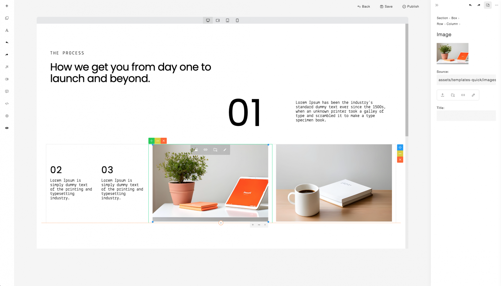
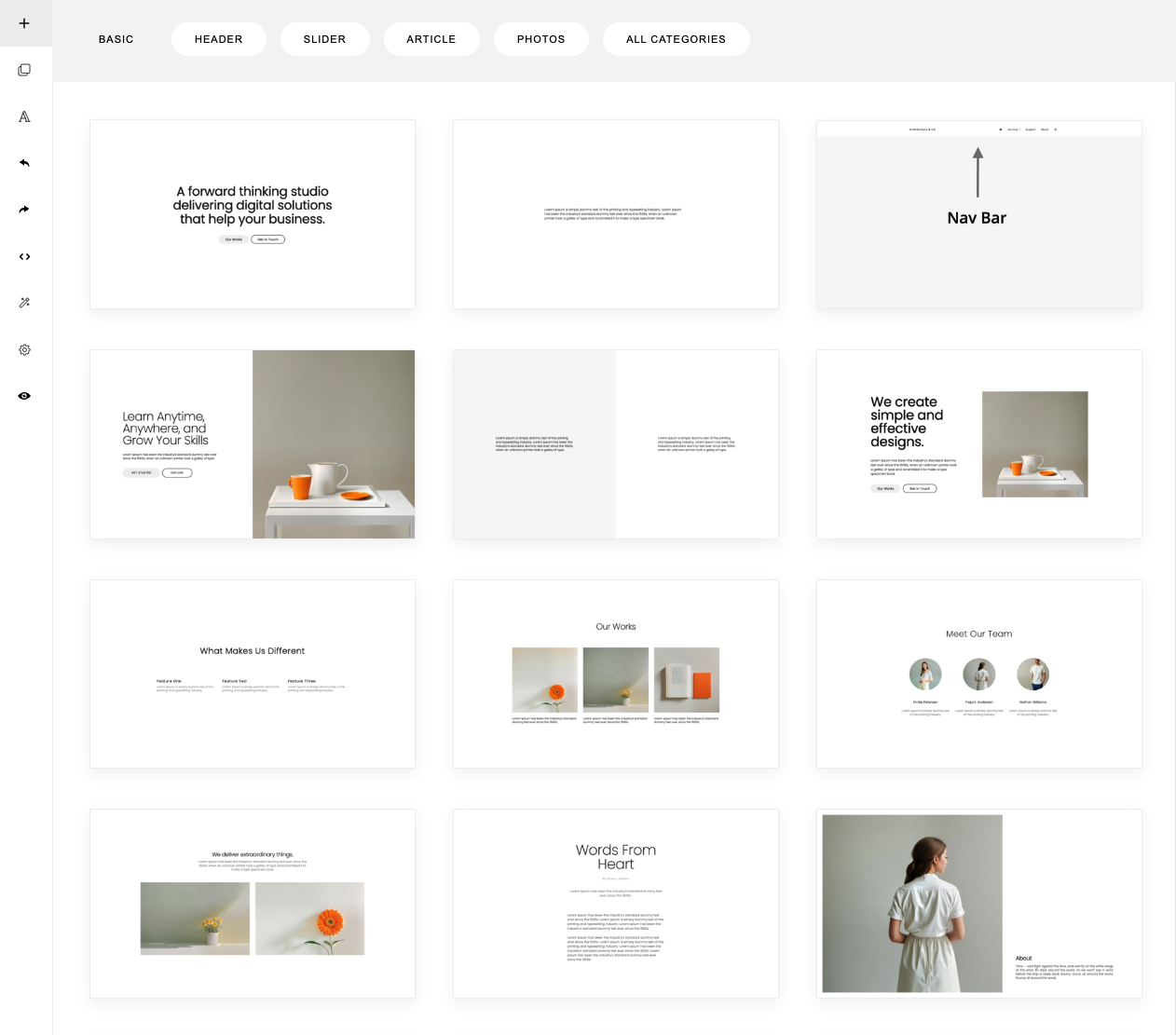
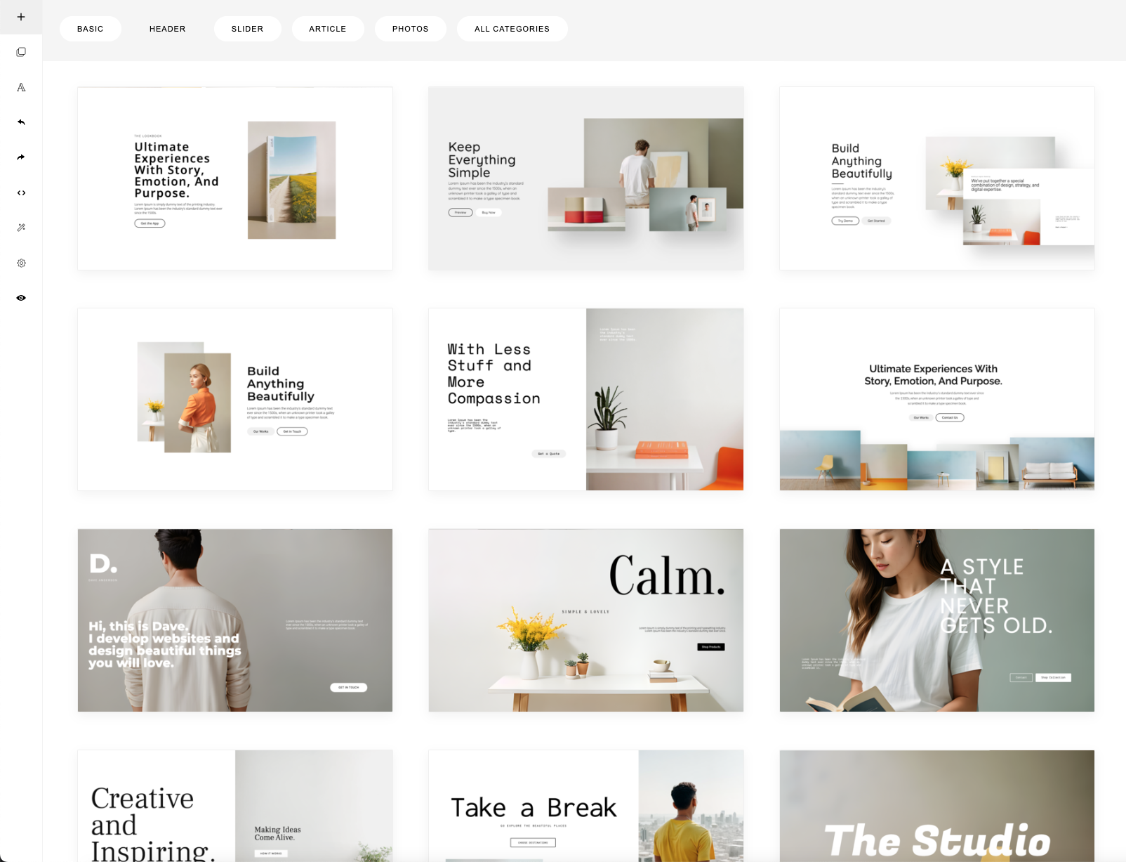
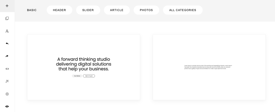
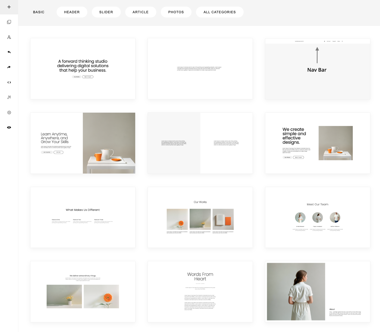
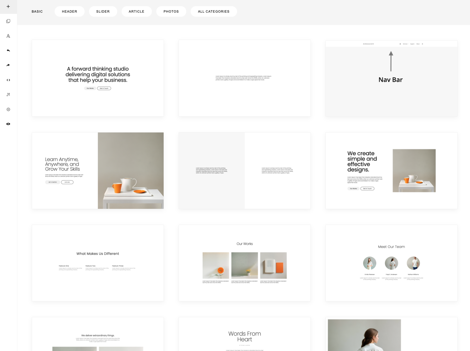
To start building a page, you can click the (+) button on the top left sidebar. This will open a selection of predesigned sections that you can add into your page.
33
34
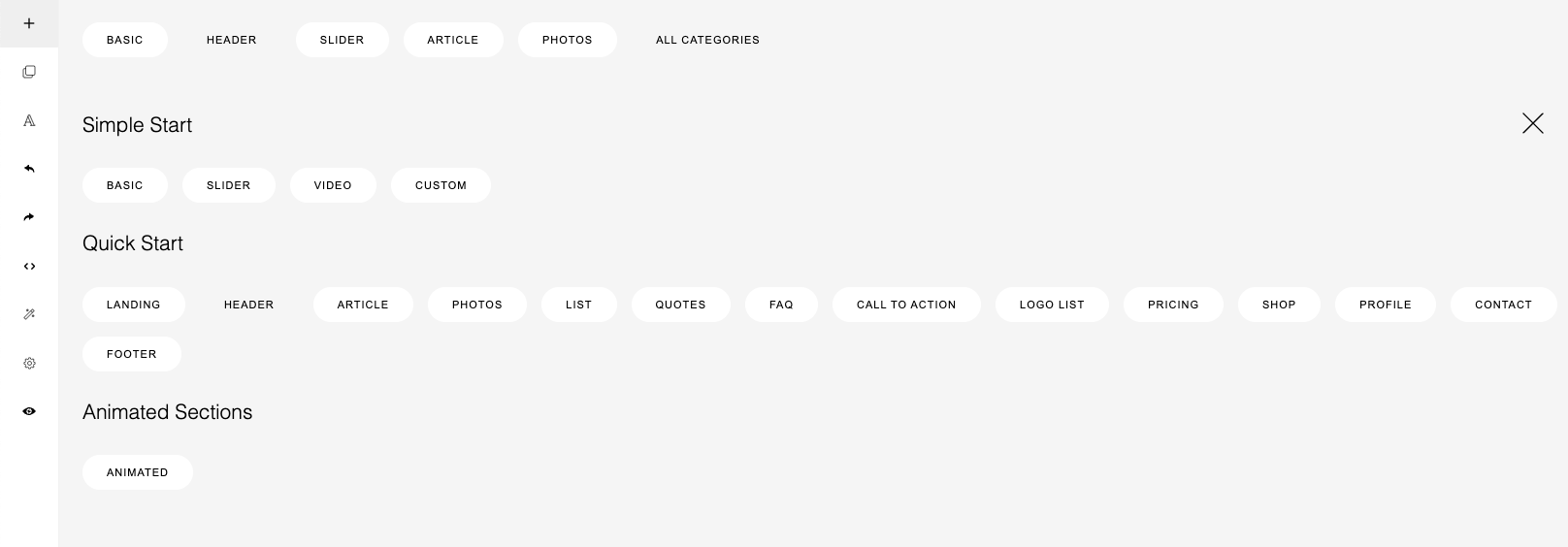
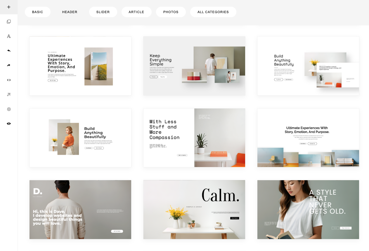
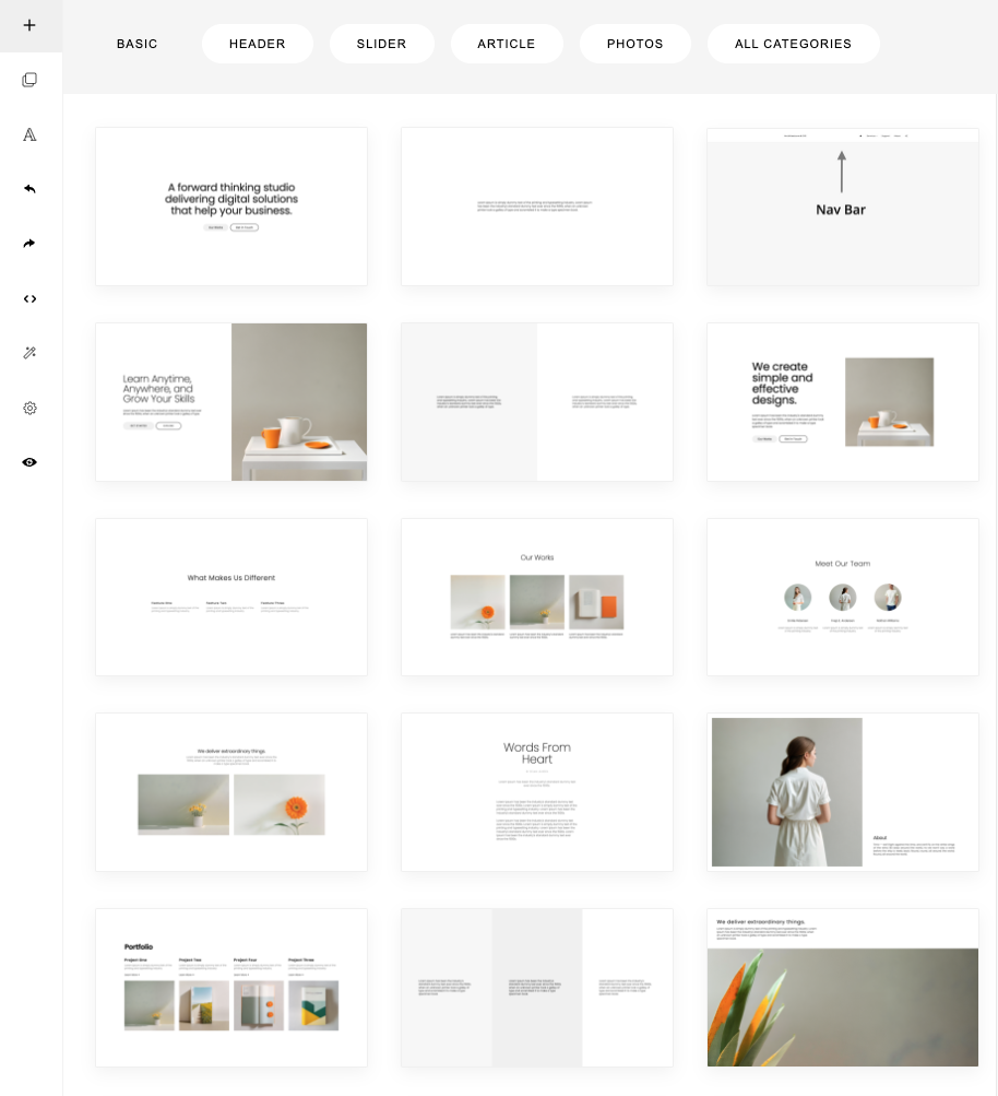
If you click ALL CATEGORIES, 3 sets of templates will be displayed:
35
These 3 set of templates are located in the folder:
Each folder contains:
The templates are loaded using the following configuration:
36
const builder = new ContentBox({
    wrapper: '.is-wrapper',
    templates: [
        {
            url: 'assets/templates-simple/templates.js',
            path: 'assets/templates-simple/',
            pathReplace: [],
            numbering: true,
            showNumberOnHover: true,
        },
        {
            url: 'assets/templates-quick/templates.js',
            path: 'assets/templates-quick/',
            pathReplace: [],
            numbering: true,
            showNumberOnHover: true,
        },
        {
            url: 'assets/templates-animated/templates.js',
            path: 'assets/templates-animated/',
            pathReplace: [],
            numbering: true,
            showNumberOnHover: true,
        },
    ],
});
Using the templates parameter, you can configure the template file (url), the asset location (path), and optionally, use pathReplace property to replace string found on the template file.
37
Here is an example of a different assets location:
const builder = new ContentBox({
    wrapper: '.is-wrapper',
    templates: [
        {
            url: 'https://path-to/assets/templates-simple/templates.js',
            path: 'https://path-to/assets/templates-simple/',
            pathReplace: [],
            numbering: true,
            showNumberOnHover: true,
        },
        {
            url: 'https://path-to/assets/templates-quick/templates.js',
            path: 'https://path-to/assets/templates-quick/',
            pathReplace: [],
            numbering: true,
            showNumberOnHover: true,
        },
        {
            url: 'https://path-to/assets/templates-animated/templates.js',
            path: 'https://path-to/assets/templates-animated/',
            pathReplace: [],
            numbering: true,
            showNumberOnHover: true,
        },
    ],
});
const builder = new ContentBox({
    wrapper: '.is-wrapper',
    designUrl1: 'assets/designs/basic.js',
    designUrl2: 'assets/designs/examples.js',
    designPath: 'assets/designs/',
});
38
In the old ContentBox, you can configure the template location by setting the designUrl1, designUrl2 and designPath parameters. These still work. Note that in the old version, templates are located in assets/designs/ folder.
In case of a different assets location, path adjustment may be needed. Here you can use the designPathReplace parameter.
const builder = new ContentBox({
    wrapper: '.is-wrapper',
    designUrl1: 'https://path-to/assets/designs/basic.js',
    designUrl2: 'https://path-to/assets/designs/examples.js',
    designPath: 'https://path-to/assets/designs/',
    designPathReplace: ['assets/designs/', 'https://path-to/assets/designs/'], // replace the default path to the new location
});
In this example, the default location is changed to https://path-to/assets/designs/
With this, you can place all the assets in a separate server or different host (e.g. from a CDN).
39
Let’s see one of the template file, the Simple Start template: assets/templates-simple/templates.js.
var data_templates = {
    name: 'Simple Start',
    categories: [
        { id: 1, name: 'Basic' },
        { id: 2, name: 'Slider' },
        { id: 3, name: 'Video' },
        { id: 4, name: 'Custom' },
    ],
    designs: [

		{
		    'thumbnail': 'preview/simple-01.png',
		    'category': '1',
		    'contentCss': 'type-poppins.css',
		    'contentClass': 'type-poppins',
		    'html': `
			<div class="is-section is-box is-section-100 type-poppins">
            ...
            </div>`
		},
        ...

	]
};

try {
    template_list.push(data_templates);
} catch(e) {
    //
}
In this JSON format, you can define the template set name, categories, and the template collection (designs).
Ini this set, we have 4 categories:
1. Basic
2. Slider
3. Video
4. Custom
For each section template, you need to specify:
With the same format, you can create your own template set and load it in ContentBox.
40
Let’s the other template file, the Quick Start template: assets/templates-quick/templates.js.
var data_templates = {
    name: 'Quick Start',
    categories: [
        { id: 15, name: 'Landing' },
        { id: 1, name: 'Header' },
        { id: 2, name: 'Article' },
        { id: 3, name: 'Photos' },
        { id: 4, name: 'List' },
        { id: 5, name: 'Quotes' },
        { id: 6, name: 'FAQ' },
        { id: 7, name: 'Call to Action' },
        { id: 8, name: 'Logo List' },
        { id: 9, name: 'Pricing' },
        { id: 10, name: 'Shop' },
        { id: 11, name: 'Profile' },
        { id: 12, name: 'Contact' },
        { id: 14, name: 'Footer' },
    ],
    designs: [

        ...

	]
};

try {
    template_list.push(data_templates);
} catch(e) {
    //
}
Ini this set, we have 15 categories, from Header, Article, to Footer.
41
The 3 template files are loaded by registering them in the templates parameter:
const builder = new ContentBox({
    wrapper: '.is-wrapper',
    templates: [
        {
            url: 'https://path-to/assets/templates-simple/templates.js',
            path: 'https://path-to/assets/templates-simple/',
            pathReplace: [],
            numbering: true,
            showNumberOnHover: true,
        },
        {
            url: 'https://path-to/assets/templates-quick/templates.js',
            path: 'https://path-to/assets/templates-quick/',
            pathReplace: [],
            numbering: true,
            showNumberOnHover: true,
        },
        {
            url: 'https://path-to/assets/templates-animated/templates.js',
            path: 'https://path-to/assets/templates-animated/',
            pathReplace: [],
            numbering: true,
            showNumberOnHover: true,
        },
    ],
});
Template loading is asynchronous so it won’t block the initial page loading.
42
Then choose which category to display on the first open:
const builder = new ContentBox({
    ...
    defaultCategory: {
        id: 1,
        designId: 1
    },
});
const builder = new ContentBox({
    ...
    featuredCategories: [
        { id: 1, designId: 1, name: 'Basic' },
        { id: 1, designId: 2, name: 'Header' },
        { id: 2, designId: 1, name: 'Slider' },
        { id: 2, designId: 2, name: 'Article' },
        { id: 3, designId: 2, name: 'Photos' },
    ],
});
The Simple Start set has designId=1 and the Quick Start set has designId=2 (according to the load order).
The id refers to the category id.
You can feature certain categories that will be displayed on the front using featuredCategories parameter:
Here we choose the Basic category (id: 1), from the simplestart set (designId: 1).
43
To adjust the template’s thumbnail size, use templateThumbnailSize parameter:
const builder = new ContentBox({
    ...

    templateThumbnailSize: 'small',
});
The default is empty string (means dynamic or auto adjust based on the screen size).
For specific size, use: small, medium, or large.
Small
Medium
Large
Snippets are predesigned blocks that you can add or drag & drop into your content.
Snippet selection can be opened from the left sidebar.

44
Snippet files are located in the folder:
assets/minimalist-blocks/
It contains:
You can configure the snippets location by setting the snippetUrl and snippetPath parameters:
const builder = new ContentBox({
    wrapper: '.is-wrapper',
    snippetUrl: 'assets/minimalist-blocks/content.js', // Snippet file
    snippetPath: 'assets/minimalist-blocks/',  // Location of snippets' assets
});
45
In case of a different location, path adjustment may be needed. Here you can use the snippetPathReplace parameter.
Example:
const builder = new ContentBox({
    wrapper: '.is-wrapper',
    snippetUrl: 'https://path-to/assets/minimalist-blocks/content.js', // Snippet file
    snippetPath: 'https://path-to/assets/minimalist-blocks/',  // Location of snippets' assets
    snippetPathReplace: ['assets/', 'https://path-to/assets/'], // replace the default path to the new location
});
In this example, the default location is changed to https://path-to/assets/minimalist-blocks/
With this, you can place all the snippet assets in a separate server or different host (e.g. from a CDN).
46
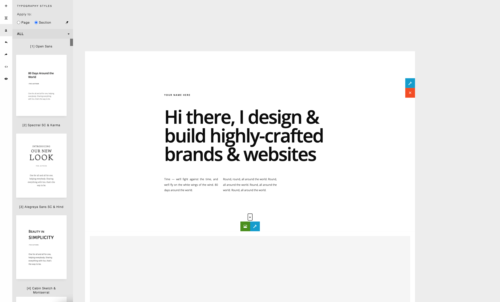
A selection of typography styles is provided for you to choose to format your page. The selection can be opened from the left sidebar.
47
The style can be used to format the entire page or just a specific section of your page.
Typography style files are located in the folder:
assets/styles/
It contains all the css needed and its preview images. You can change its location using the contentStylePath parameter.
const builder = new ContentBox({
    wrapper: '.is-wrapper',
    contentStylePath: 'assets/styles/',
});
48
<link href="assets/scripts/glide/css/glide.core.css" rel="stylesheet" type="text/css" />
<link href="assets/scripts/glide/css/glide.theme.css" rel="stylesheet" type="text/css" />
<script src="assets/scripts/glide/glide.js" type="text/javascript">
The new version includes predesigned slider templates (using Glide slider) that require some includes:
To enable the slider:
const builder = new ContentBox({
    /*...*/
    slider: 'glide' // default: 'slick' (old version slider)
});
Values:
49
With the Language file, you can translate the ContentBox.js interface into another language.
The language file is located in:
contentbox/lang/en.js
To enable the language file, you need to add the file before including ContentBox.js:
<script src="contentbox/lang/en.js" type="text/javascript">
Here is the language file content as seen on en.js:
var _txt = new Array();
_txt['Bold'] = 'Bold';
_txt['Italic'] = 'Italic';
You can create your own language file by copying/modifying this file.
50
To add custom buttons on the sidebar, use the addButton method.
Here is an example of adding the Undo & Redo button. For the undo and redo operation, we call the undo() and redo() methods.
builder.addButton({
    'pos': 2, // button position
    'title': 'Undo', // title
    'html': '<svg class="is-icon-flex" style="width:14px;height:14px;">', // icon
    'onClick': ()=>{
        builder.undo();
    }
});

builder.addButton({
    'pos': 3, // button position
    'title': 'Redo', // title
    'html': '<svg class="is-icon-flex" style="width:14px;height:14px;">', // icon
    'onClick': ()=>{
        builder.redo();
    }
});
51
The addButton method has 4 parameters:
builder.addButton({
    'pos': 5,
    'title': 'Preview',
    'html': '<svg class="is-icon-flex" style="width:16px;height:16px;">',
    'onClick': ()=>{

        var html = builder.html();
        localStorage.setItem('preview-html', html);
        var mainCss = builder.mainCss();
        localStorage.setItem('preview-maincss', mainCss);
        var sectionCss = builder.sectionCss();
        localStorage.setItem('preview-sectioncss', sectionCss);

        window.open('/preview.html', '_blank').focus();
    }
});
Here is another example for adding a Preview button. If clicked, the button will open a separate page (preview.html) that we use to preview our edited page as in production.
Here we get the content and its styles using the html(), mainCss(), and sectionCss() methods and save them into the browser’s local storage. The content will then be used in the preview.html for viewing.
52
We will look on how to add a button on the sidebar that opens a custom panel. You can create your own custom panel by creating a simple html page. In this example, we will have a panel with multiple buttons that can add a custom content/section into your page. You can try the example in the package by opening: public/example-custom.html. (from localhost or from your server).
53
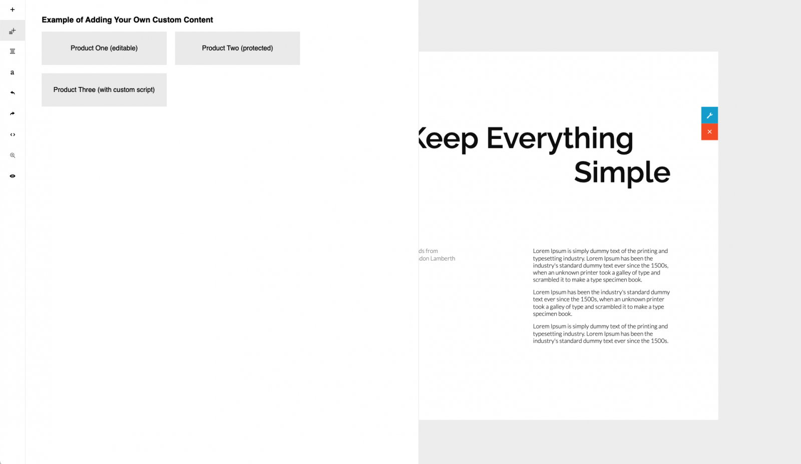
Click the buttons to try adding a new custom content/section into the page.
54
Let’s look at the code.
To add a button on the sidebar, use addButton() method (this method has been explained in the previous chapter: Adding Custom Buttons on the Sidebar):
The src property is set with your custom html page, mypanel.html. This simple html page contains the buttons for adding content. Each button simply calls the addSection() method.
The addSection() method accepts two parameters:
parent.contentbox.addSection(html, css)
mypanel.html
builder.addButton({
    'pos': 0,
    'title': 'Products',
    'src': 'mypanel.html',
    'html': '<svg style="width:17px;height:17px;" viewBox="0 0 2048 2048" xmlns="http://www.w3.org/2000/svg">' +
        // ...
        '</svg>',
    'class': 'sidebar-sections'
});
example-custom.html
Example:
55
Here we choose type-rufina-oxygen.css for the typography css. Then we added type-rufina-oxygen class in the div.is-section element. This will format the content with the Rufina & Oxygen fonts.
<div class="is-section is-box is-section-100 type-rufina-oxygen">
...
</div>
Use the same format as in the example if you want to create your own content. Please leave the other classes in the example as they are needed by ContentBox to format the content.
mypanel.html
parent.contentbox.addSection(`
    <div class="is-section is-box is-section-100 type-rufina-oxygen">
        <div class="is-boxes">
            <div class="is-box-centered">

                <div class="is-container v2 is-content-960 leading-13 size-17">
                    <div class="row">
                        <div class="column full">
                            <h1 class="text-center leading-09 size-92">Product One</h1>
                        </div>
                    </div>
                </div>

            </div>
        </div>
    </div>
    `, 'type-rufina-oxygen.css');
To make the content protected (non editable), please add protected class on the div.is-section. and do not use is-container class. The is-container class is used for text content inside the section and it is always editable.
56
If you need to add custom Javascript, please use the following format:
<div class="is-section is-box is-section-100 type-rufina-oxygen protected">
    <div class="is-overlay">
        <div class="is-overlay-content"
            data-module="code"
            data-module-desc="My Code"
            data-html="[... encoded custom script here ...]">
        </div>
    </div>
</div>
mypanel.html
<div class="is-section is-box is-section-100 type-rufina-oxygen protected">
...
</div>
mypanel.html
57
For the complete code, please open the mypanel.html with your code editor.
Here is an example:
mypanel.html
parent.contentbox.addSection(`
    <div class="is-section is-box is-section-100 is-light-text type-rufina-oxygen protected">
        <div class="is-overlay">
            <div class="is-overlay-content"
                data-module="code"
                data-module-desc="Custom HTML or Javascript "
                data-html="${encodeURIComponent(`

                    <!-- custom script here -->

            `)}">

            </div>
        </div>
    </div>
    `, 'type-rufina-oxygen.css');
© 2026 InnovaStudio
 Store
Store